Hi there,
could you please give me a hint what is wrong with my image?
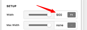
The image in question (at the bottom of the page) is very wide (composed of several single logos) and well positioned on Mac oder Notebook screen. But on mobile only the left half is visible. Please see screenshot of my settings. I can’t get “responsive” working I’m afraid…


Any help would be great.
Regards, Karen