Image underneath a layer that moves

Hi There,

I’m hoping someone can help!

I want a function on my website, but am unable to explain very well what it is. If you go to this website you will see what I mean. https://www.gutinstinct.co.uk/

As you scroll down the page you can see a coffee cup. It looks like it’s underneath the page, which moves slightly - It looks brilliant on a mobile device.

Can anyone direct me to the HOW TO DO THIS?

Thanks for reading.
Hello Tracy,

Thanks for writing to us

You can set the section background and set it as Parallax similar as you mentioned

Go to your page and edit the page
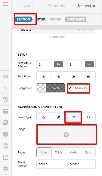
Now go the section setting add background Image

Please have a look at the given screenshot

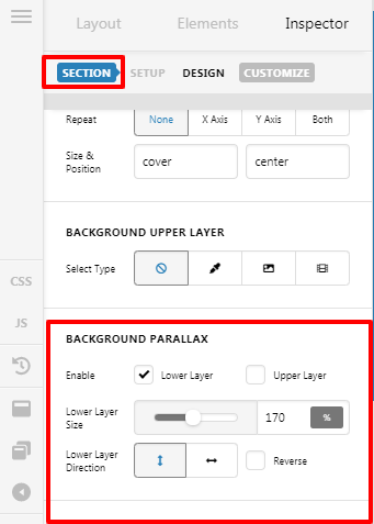
Now scroll down there and find out Background Parallax

Please have a look at the given screenshot

bg2

Here you can set the Parallax. You can customize as per your design

Hope It Helps
Thanks

Hi There,

Thank you for your reply. That’s great!

There are just a few more questions I need help on.

Here is the link to the website

  1. I would like to see more of the image on desktop; the sides of the image are cut off and I would like to be able to see more height of the image .
  2. On mobile device the image shows the center of the picture (one man on a digger) Is it possible to show the whole image on mobile device using the parallax scrolling?

Thank you for reading this. :grinning:

Hi Tracy,

There is no content set for the section where the parallax image has been set, if you don’t want to add any content please use the Gap element to add more height into it with blank spaces.

Increasing the height by adjusting the Gap Size of the Gap element will adjust the image even in the mobile devices.
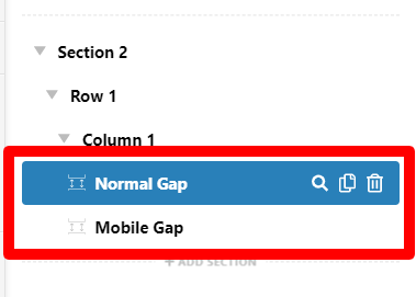
If you want that the image size will be bigger in mobile* devices, you need to add the Gap element for mobile and other devices separately with a different value for the Gap Size.

test-18-08-2020-Content-Pro (1)

And you can make the Gap element show or hide for specific devices from the Customize tab Hide During Breakpoint attribute under the element.

Hope it helps.

Thanks

Hi There,

That’s looking better, I still can’t see the guys, either side of the image, they appear to be cut off on desktop.

What do I do here?

Oh, yes I can’t find the Mobile Gap Element!

Thank you.

Hi Tracy,

When using parallax features, please note that the image is attached as a fixed background in the browser regardless of the content. This is how it works by default for the parallax effect. See how it works here: http://demo.theme.co/integrity-1/ below the Incredible shortcode headline. The face of the image is hidden at first but as you scroll it is revealed. On your case, if the parallax is on the top section of the page, please try to leave an empty space on top of the image background.

The Mobile Gap shown here isn’t an element. It’s renamed of a gap element to understand better. @Tristup Asks you to add two Gap element and one renamed to Mobile Gap. Use the Normal Gap section for big-screen devices and the Mobile Gap section for smaller screen devices. Now control show or hide for specific devices from the Customize tab Hide During Breakpoint attribute under the element.

Thanks

This topic was automatically closed 10 days after the last reply. New replies are no longer allowed.