Hello Apex,
Images are responsive in the Pro Theme by default.
If I display a picture (in my case a user review) that’s 684px wide, just below the max width of my site, it displays fully on computers, and gets shrinked on mobile phones, which is the expected behaviour.
Nevertheless, I like my pictures to be Retina enabled, so what I’ve done with the other images of my website is to have them stored in twice the required resolution and then display them in 50% dimensions using the 50% block setting in the Gutenberg editor. It works very well for small images that fit fully even on mobile phones, as they displayed in crisp resolution. On the other hand for larger images it prevents them from shrinking on smaller screen estate. For now I have avoided the problem by posting non retina yet responsive pictures, it works but looks off compared to the rest of my web site on both my iMac and my iPhone. Retina is not an option anymore on the web.
How can I have both Retina quality (@2x) and responsive pictures?
Thank in advance for your answer!
Hi @Lombard
Could you please provide some links showing this issue? like a working example with non-retina responsive images and another example showing the retina non-responsive images on your website?
Thanks.
I cannot provide both at the same time.
Check on the website indicated in the secure note, the picture of the first user review.
This is an example of a Retina resolution picture displayed at 50% (to provide Retina crispness) that is not responsive.
When you’re ready I can switch that image to the non-retina version that is responsive (because with no size CSS instruction).
Hi @Lombard
I’ve checked your website and I don’t think this is a default Cornerstone content, I believe you are using Gutenberg builder? please provide us with WordPress Dashboard login details in a “Secure Note” so we can investigate this issue.

Thanks.
Yes I use the Gutenberg builder. This makes it out of the range of your support, I understand. Does your own editor support retina pictures? I haven’t tried it yet.
Hi @Lombard
Yes, it does. Just use the “Image” element and click on this icon:
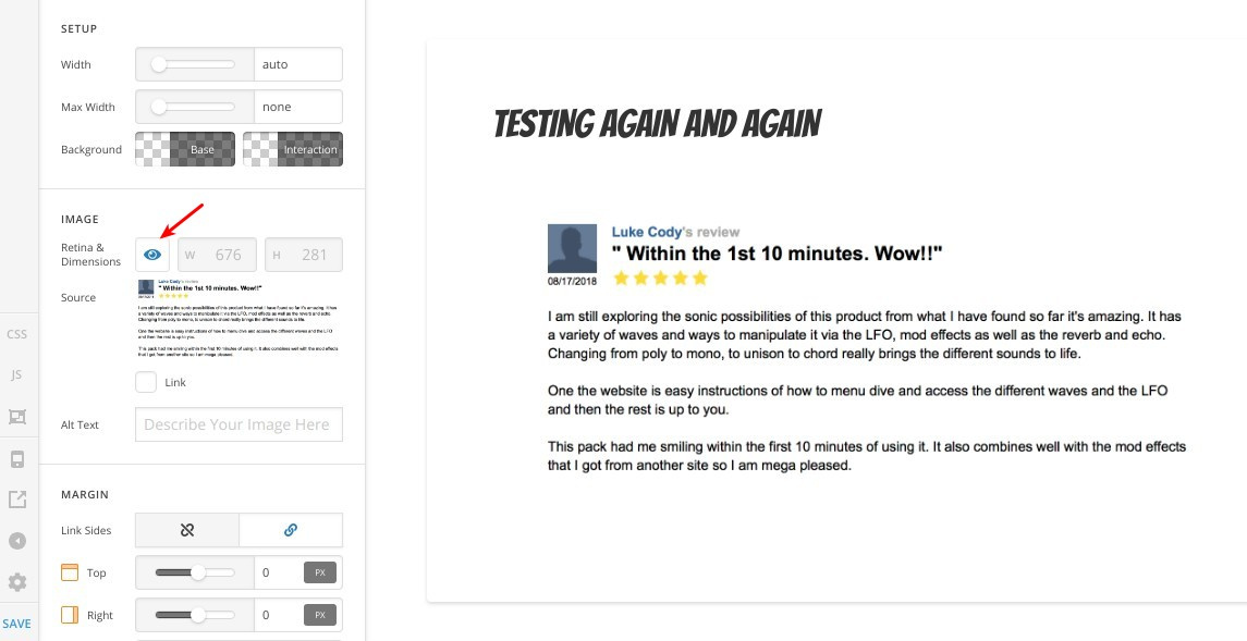
That’s it, you will get a responsive retina ready image.
Thanks.
Thanks, I will switch to your editor then.
You are most welcome!
If you need anything else we can help you with, don’t hesitate to open another thread.
This topic was automatically closed 10 days after the last reply. New replies are no longer allowed.