Hi Xters,
I’m using XTheme 5.25 and am having some issues with my header and hero images which respond correctly when resized to mobile on my desktop computer… but fail on an actual iPhone 7-plus.
http://www.labeachcitieshomes.com/xtheme/
Using my homepage as an example:
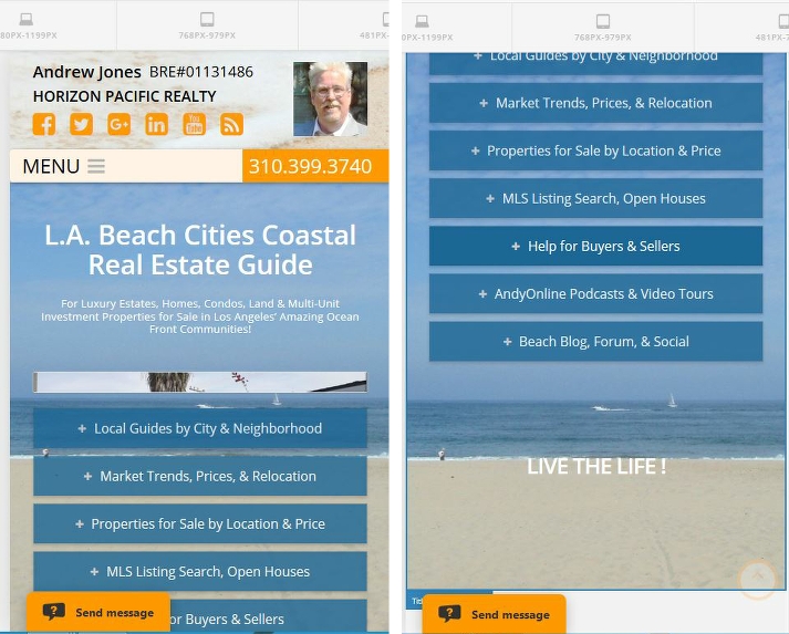
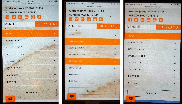
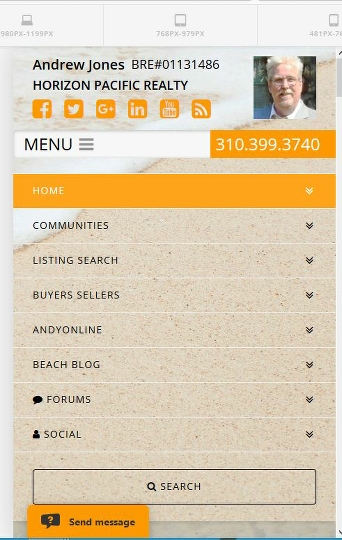
Surf & Sand Header Image - becomes hyper-zoomed in and very blurry on actual iPhone on homepage (and some other pages too,) but responds correctly and looks fine on other mobile pages (see Home > Big Beach Cities Map.) It may be worth noting that the header image also serves as the mobile menu BG only on mobile sizes.
Open Beach Hero Image on Homepage w/ Parallax FX - Hero image seems to resize correctly to allow for parallax on desktop when resized to mobile, but seems locked in place with no parallax effect on actual iPhone 7-plus. This also seems to be the case with the only other page I’ve built so far with a hero image: Communities > Venice Beach.
Thanks for your help.