Hi Im trying to make the image square and fill the column like the photo at the bottom. Should i use the split menu or is there a better way. Thanks


Hi Im trying to make the image square and fill the column like the photo at the bottom. Should i use the split menu or is there a better way. Thanks


Hi Onaje,
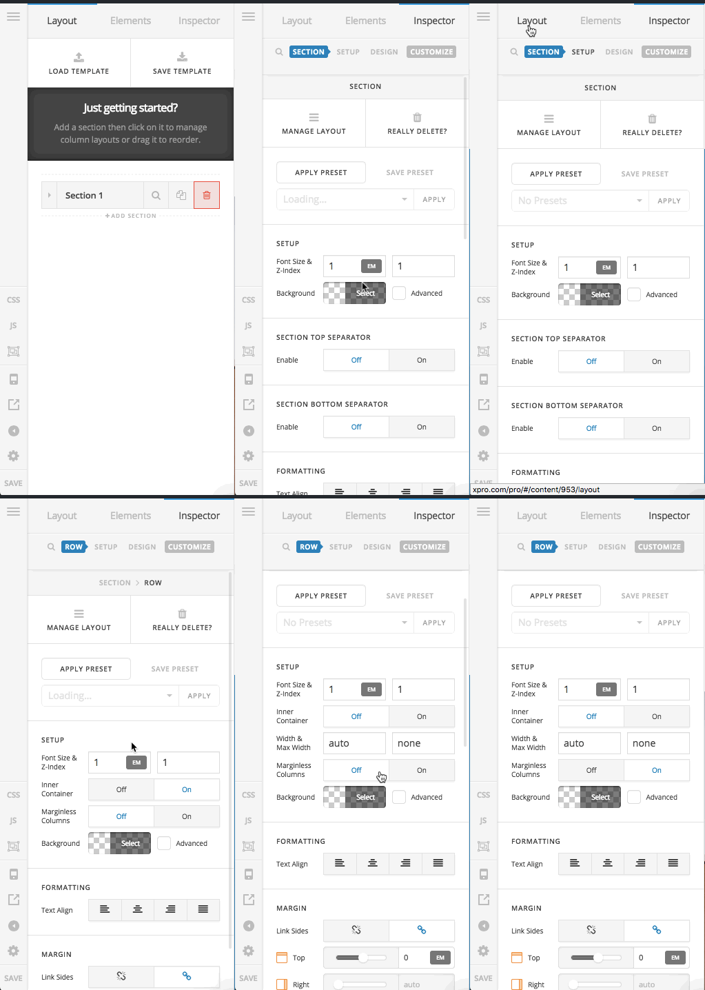
I suggest that you use a section with 2 columns. In the section please set the section to be marginless by clicking the option below:

After that click on the left column and in the options you will be able to add a background image:

Remember to click on the Advanced option to be able to add the image. For more information please read the background section of the article below:
That way you will have a background image for a column which always takes the whole column, and in the other column, you can add whatever element you want.
Thank you.
Thank you for the link to the videos they’re very helpful. The only issue Im have with this section is removing the padding on the mobile version MadebyNashish.com

Hi,
To add padding in mobile, you can add the code below in Theme Options > CSS
@media (max-width: 767px) {
.x-section .x-container.marginless-columns:not(.width) {
    width: 80%;
}
}
Hope that helps.
thanks for the reply but I want to “remove” the padding on mobile version. Not add more.
Hi Onaje,
The padding that you see is actually related to the Padding setting inside the Row which you added the columns. It seems that option is working ok for you in the desktop but not necessarily in the mobile.
Now you have to ways to fix this. You can copy the section in question so that you will have 2 versions of the section. Then you can use the Hide During Breakpoint option to hide one section for the mobile and another one for the desktop.
Then whatever section which you decide will show in the mobile can have the padding of 0 in the Row options. To access the Row options you need to click on the Magnifying Glass of the Row in question:

The other choice is that you go to the section in question and click on the Customize tab and add a unique class, for example: nopadding

Then you need to add the CSS code below to Pro > Theme Options > CSS
.nopadding .x-container {
    padding-left: 0 !important;
    padding-right: 0 !important;
}
Hope it helps.
Thank you so much this really helped!!
Glad that we could help you!
I’ve notice you guys suggest using the background image of a section for fullwidth images but i’d like to know if its possible to add an image to a section with “elements” and make it any dimensions I like. I want the feature image on my post page to be hi res. Like the second photo below. I’m creating a template that will be added to all my post. Thank you


Hello @Nashish,
Thanks for updating the thread. 
To add Images using elements you can add using the Content Builder Image Element on a full width section or Global block (in case you want to create a template kind of framework and want to use over multiple locations on the website.)

To learn more about Global block, please take a look at following article.
To learn more about various option that are there in Sections, Row and Columns please take a look at following tutorial.
Thanks.
Im ok with the height of the image but i’d like the image to be centered and cover across the entire section. How can I do this?


Hi @Nashish
What was mentioned by my colleague @Prasant should be enough to create that, to allow us investigating why this didn’t work, we will need to check your website link, please provide us with the exact page showing this image.
Thanks.
Hello @Nashish,
Thanks for updating the thread.
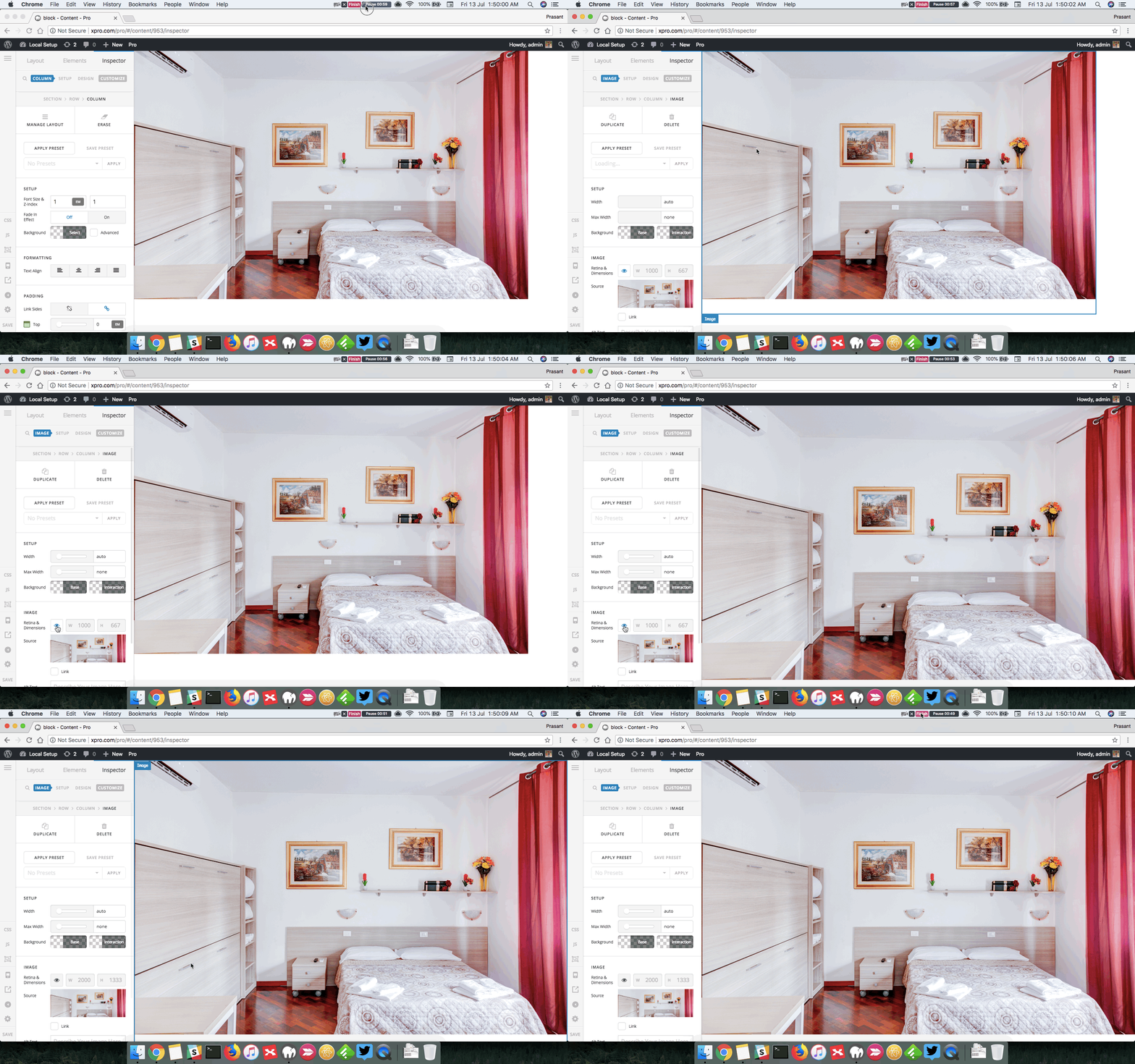
Looking at the source code of the link you have shared I think you might have forgotten to disable the Retina eye button in image element. Please click on that and see how it goes. Here is a screencast.

Let us know how it goes.
Thanks.
The retina button was disabled. Im not able to change the height or width next to the retina button.

Hi There,
Please inspect the Image element and under the customize tab, please add this to the Element CSS area
$el.x-image,
$el.x-image img {
	width: 100%;
}
Hope it helps,
Cheers!
Great thanks for that css worked perfectly! My only problem is I had the image set to the fullwidth of the page. It changed for some reason how do i get is back? Is there css i can use?
Hi There,
Please use the Blank - No Container | Header, Footer page template for your page.
Hope it helps,
Cheers!
This topic was automatically closed 10 days after the last reply. New replies are no longer allowed.