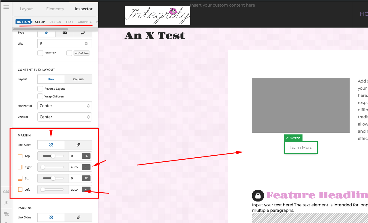
Hi, I’m working on a website and in the footer I’ve got a column of buttons and I want them to appear one under each other (this views correctly on a desktop), but when you view it on a mobile they are side by side on the same line! Is there a way to do it so they are each on a separate line without having to apply a margin to the right, as I have tried this and it looks odd when you then view it on an iPad!
I’ll put the URL in a secure note as it’s being built on a temporary link.
I’ve attached some screen grans for your reference.


Thanks!