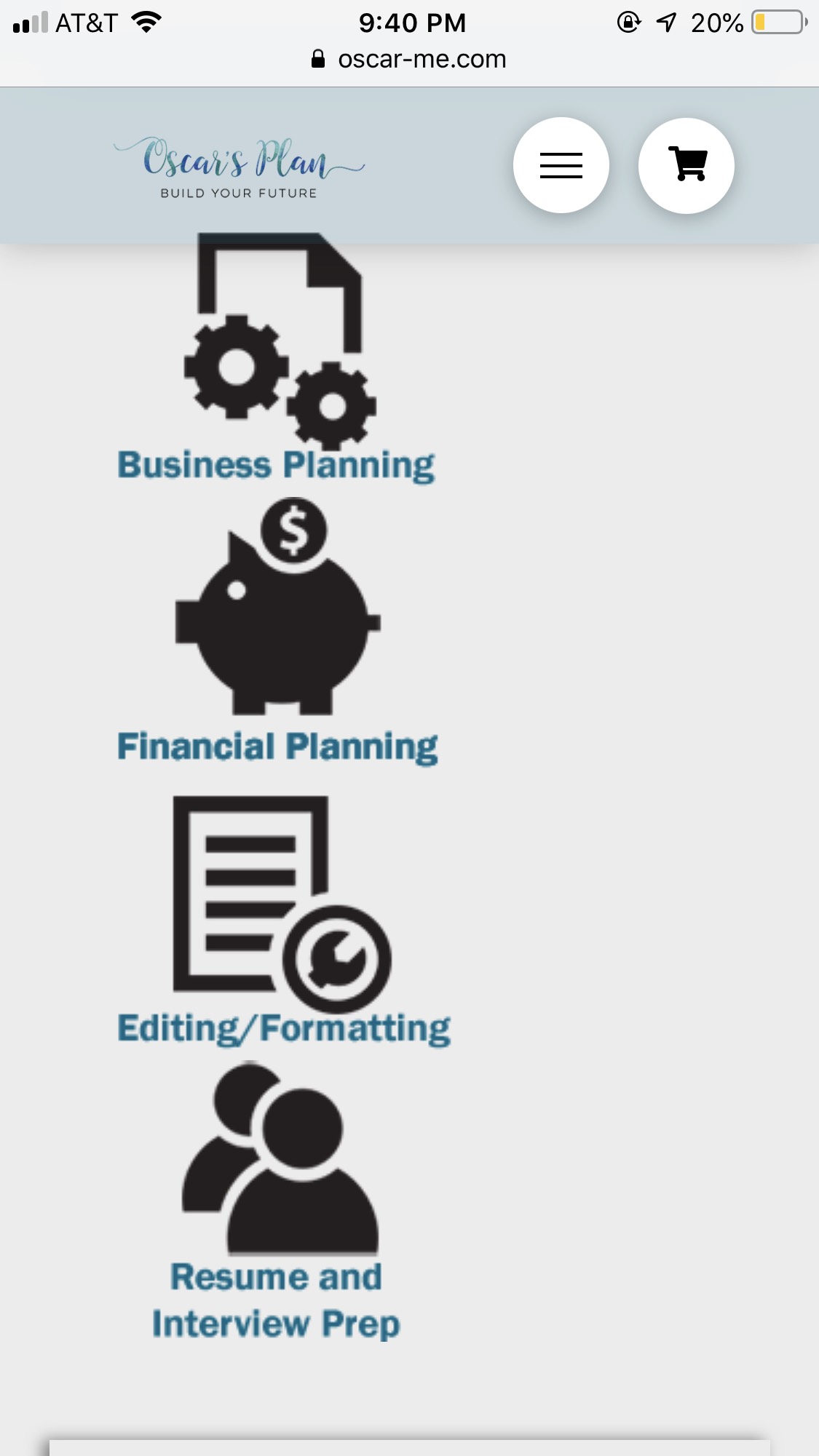
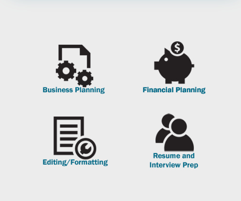
Hello - I am having trouble figuring out what I have to do to make my images/icons responsive for mobile. I need them to shrink down to a “manageable” size for mobile and position so it’s two on top, two on bottom.
Hi Amy,
Please inspect the section with the images. Go to Customize Tab > Element CSS. Try adding the following:
@media(max-width:480px){ /*Media query for mobile*/
    $el.x-section .x-1-4 {
        width:48%;
        display:inline-block;
        margin-right:0;
        float:left;
        margin-bottom:2em;
        text-align:center;
    }
     $el.x-section .x-1-4:nth-child(odd) {
        margin-right: 4%;


    }
    .$el.x-section .x-1-4 img{
        max-width: 120px; /*Adjust this to your preferred icon size on mobile*/
    }

}
That should display it like this:
Hope this helps.
Worked perfectly! Thanks so much!
You are most welcome. 
This topic was automatically closed 10 days after the last reply. New replies are no longer allowed.