I need help! Responsiveness of my text and images on very specific screen size not working

Hi there,

For some reason, I can not figure out why, if you’re all the way at the top of the homepage on a somewhat small desktop screen the text and image looks as follows:

If you scroll just a tiny bit, it looks completely normal. Not sure what the heck is going on here or how to fix. Thanks!
Hi Lauren,

Thank you for reaching out to us. I checked your site in couple of browsers and in different screen resolutions but I couldn’t replicate the issue on my end. This could only be the cache issue. Try clearing all caches including your browser’s cache and see if this resolves the issue.

Let us know how this goes!

Hi Nabeel,

In Row 1 on the homepage, I turned the “Global Container” to on, which helped the scaling issue, but now the image doesnt stretch the full width of the screen. If you want to see the issue in action, you can check the About Us or Member Benefits page. Both of those still have the Global Container set of Off and are producing the same issue mentioned above.

Hey Lauren,

Thank you for providing the URLs. I checked your pages and this seems to be related to your header, when the header links drop down to the next line it disturbs the layout of the section underneath it and that’s because your menu items have too much spacing around. We can fix this by reducing some of the padding from your menu items.

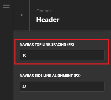
Go to Theme Options > Header > Navbar Top Link Spacing and set it to 10 or less (see screenshot)

image

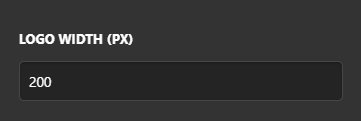
To make it more better, you can reduce the width of your logo as well via Theme Options > Header

image

Let us know how this goes!

This topic was automatically closed 10 days after the last reply. New replies are no longer allowed.