I cannot use Class to define some settings for a section to use it later for other sections

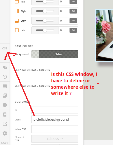
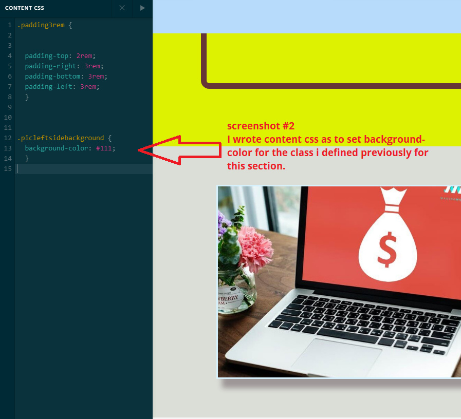
Pls see the first picture below where i named one of my section as “picleftsidebackground”, The reason to name class is to use the same settings for some more sections later in the page.

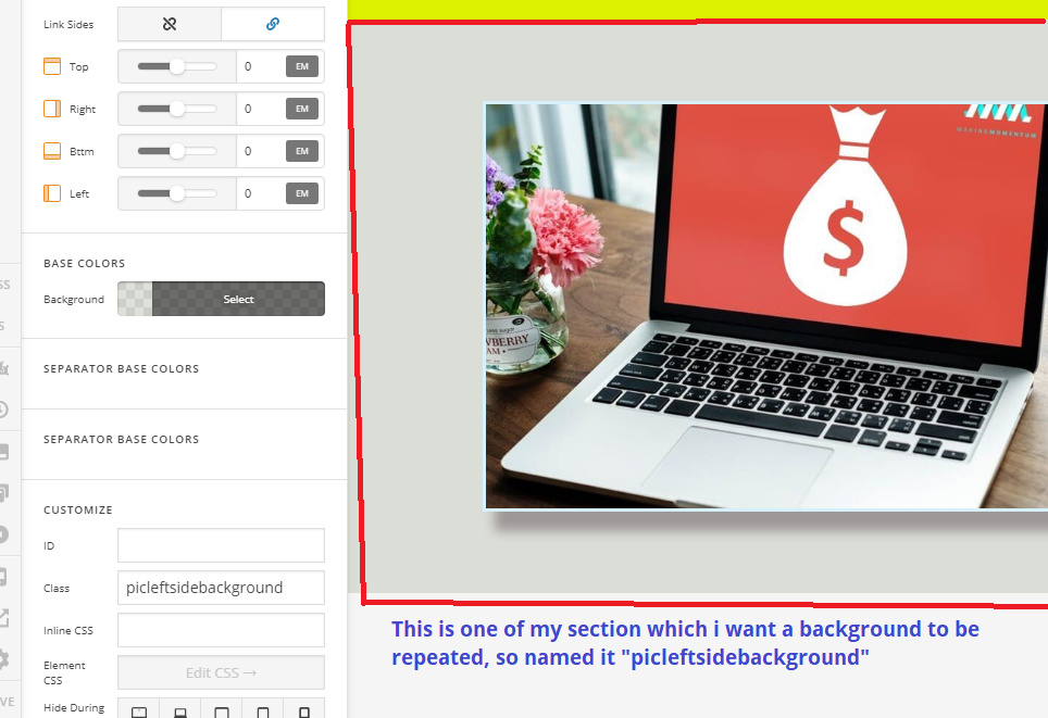
Then i wrote content css for the class above

After inspecting in browser i can see some settings appeared but not giving desired result.

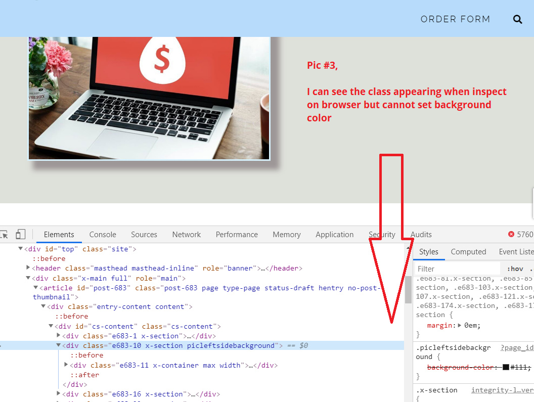
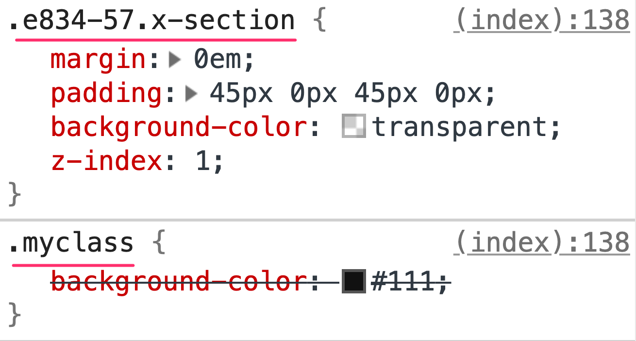
Instead of CLASS if I define this in ID tab, and writing as #picleftside… it works. But because I want to define as class what is the solution. Please can you help me to use the class extensively so that I hv not to repeat those settings. I know i can copy template or duplicate but that not helps my purpose as when i want to change the background later, for all the sections where I used this CLASS, i will simply change in css window.

I tried to search in current forum but somewhere it said you need to name it differently, Why i need different name as I do not want for the particular element, i want a general CLASS.

Hi @mujtaba677,

Thanks for writing in.

The CSS you are trying to add through the class is working but is given less priority than the background color setting of the section:

If you want your custom CSS to have higher priority than the generated CSS by the section setting, you can increase the level of specificity of the CSS selector you use so that your code will take effect.

To example it further, here is the result of the CSS including the generated CSS of the section and the custom class CSS:

Notice that the CSS selector by the generated CSS has higher specificity level than the custom class so what you can do is to also increase the level of specificity of your custom CSS like this:

.myclass.x-section {
    background-color: #111;
}

You can also make use of the !important keyword in your CSS code.

Please check this link to read more about CSS Specificity:

https://www.w3schools.com/css/css_specificity.asp

Hope this explains it.

1 Like

Yes thanks for prompt reply, i was just worried if to add particular section name but simply adding the generic words like .x-section or .x-text after myclass helps to make it prioritise. It works, thanks again

You’re welcome!
We’re glad @Jade were able to help you out.

@Jade @RueNel

Now i am using class right for swapping column, because i have vertically aligned column and also using full height display class, the column swapping or this class “right” not working for me. so this “right” class is out of focus or not preferred.

One is that i use sameway the class u suggested me earlier that .x-column to myclass but how to use right class within myclass . Or if you suggest differently to swap columns with full height and vertical center. thanks

Hey @mujtaba677,

My apologies but I am not sure about what you are describing. It will be easier for us to understand it better if you provide the URL of the site you are working on so that we can check the current setup you have currently and provide you other suggestions.

Thank you.

HI @Jade

Sorry i am using draft page so not yet live URLs, let me explain in picture below.

If i am using right class the left column is appearing on right side on desktop, no problem here.

But as soon as I m trying to use marginless column for vertically aligning columns, the right class wont work.

My requirement is:
First. I want to use a section where there will be height 100% of screen (height:100vh; ) and also the two columns content like in example below vertically align. This I dont have problem.

2nd. But as soon as i want some sections where to swap columns in mobile view, this vertical alignment is not working.

Hello @mujtaba677,

Add right and mrn to the left column so that the left column will be on the right side and then there will be no margin on the right which is what mrn stands for.

If nothing is working, please provide us the url of the page so that we can inspect it.

Thanks.

@Jade @RueNel Thanks for responding.

I am giving link privately but also posting screen shot, pls see my notes in the screenshot itself

in the screenshot below u can see both vertical alignment and full height are working but i have to remove column swap for desktop.

Hi Mujtaba,

I believe to make all three things work together you only need to replace your custom CSS with the following inside the media query:

.x-section .x-container.swapcolumns {
  display:-webkit-box;
  display: -ms-flexbox;
  display: flex;
  -webkit-box-orient: horizontal;
  -webkit-box-direction: reverse;
  -ms-flex-direction: row-reverse;
  flex-direction: row-reverse;
  align-items: center;
}

Don’t forget to clear all caches including your browser’s cache after adding the code. Let us know how this goes!

thank you @Nabeel

It works great, vertical alignment is good on desktop along with column swap and full height, now before writing i tried many things for full height vertical alignment on moblie devices, its not working can you suggests something for these small screens.

Hey Mujtaba,

To have vertically aligned columns in mobile devices add the following code as well:

@media screen and (max-width: 767px) {
    .x-section .x-container.swapcolumns {
        display: flex;
        flex-direction: column;
        justify-content: center;
    }
}

Make sure to have swapcolumns class in the section rows. Don’t forget to clear all caches including your browser’s cache after adding the code. Let us know how this goes!

thanks @Nabeel

it works after adding the above CSS, on mobile we do not need to swap my columns though even after adding its just aligning what i need and no changes in column, for me it work perfectly and that is i want…

I believe this thread is good for people who want
section full height
vertical alignment of items in columns
and swapping columns for mobile / desktop.

I have seen lot of other threads which suggesting to make duplicate sections and hide in for different devices, here with minimal adjustment everything is working fine

Thank you @Themeco team
@Jade @RueNel and @Nabeel for your help.

Hey Mujtaba,

Yes indeed this thread has a lot of learning stuff and in a very minimal way. I’m sure this will help many. We’re glad we all could help.

Cheers!

1 Like

This topic was automatically closed 10 days after the last reply. New replies are no longer allowed.