How to use a menu in pro header without using ubermenu ? I mean doing something like that menu using a menu but not using uber menu shortcode . Using inline menu but in the menu section does not appear my created menu http://demo.theme.co/integrity-1/
Hello Borislav,
Thanks for writing in!
I checked the website and can be menu in the header section. Can you please confirm? Please try clearing cache and see how it goes.
Thanks.
No , i have not set it  Would be possible to give me a short video how to set a menu without using ubermenu using pro inline header , please ? thanks
Hi Borislav,
Hope you’re well today.
My apologies but I am not certain about the issue you are having.
Adding an inline menu should be straightforward using the Pro Header Builder. You just need to add a Navigation Inline element.

Then it should look something like this:

This is the default display of the Inline Navigation element of the Pro builder. You may customize it accordingly using the settings available in the element.
Hope this helps.
I wish to change home work shop about contact with my menu . Replacing this with my menu . How could be possible to be done ? thanks
Hi Borislav,
You should be able to do so in the Navigation Inline element settings:

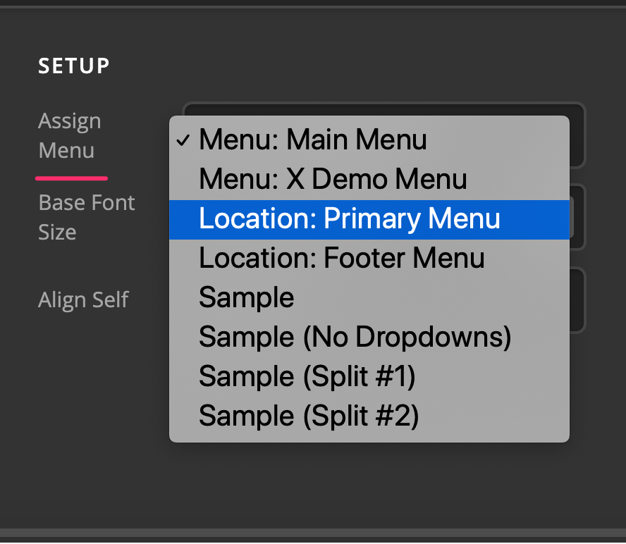
But please make sure you have created the menu first in WP Admin > Appearance > Menus.
https://codex.wordpress.org/WordPress_Menu_User_Guide
Hope this helps.
Ok Done ! Btw i wish to have 2 different menus ( the same menu but the 1st one for pc and laptops ) and the second one for mobile devices . I wish to use 2 different headers ( each one for different devices ) How can i do it ? I mean selecting the header for PCs for all pages would remove the previous header selected for all the pages (pc laptops vs mobile devices . I know that the header could be hidden /shown in certain devices and i know how to do it . but the crucial thing is what i must select for all the pages option in order to use 2 different headers for all the pages
I wish to copy the behaviour of this menu header . Extended on pc /laptop . Hamburger on mobile devices .
Hi Borislav,
You can add a Navigation Inline and a Navigation Collapsed element in a container then set the elements’ Hide During Breakpoints option accordingly so that the navigation inline will display on desktop and navigation collapsed will display on mobile.



Hope this helps.
This topic was automatically closed 10 days after the last reply. New replies are no longer allowed.