How to optimize the Smartphone Version of my Website

Hi there,
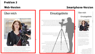
I am trying to find out how to optimize the smartphone version of my website. Right now the browserversion looks good, but there are several problems with the smartphone version. I hope you can give me some pointers… As I am a new user and am only allowed to include one picture, I combined all three Screenshots into one.

Problem 1. I use a slideshow with pictures and the name of the website. In the smartphone version the website name (and the start button) are cut - see picture

Problem 2. I do list services in a table and use icons as bulletpoints. In the smartphone version those icons are HUGE! - see picture

Problem 3. I have one section that has two side by side columns. In the smartphone version the two columns are combined into one (in a way that does not make sense anymore) - see picture

I would be thankful for any kind of help.
Hey @cs_film,

Problem 1 There’s a lot of responsive settings you could try here but one particular point out tweaking the Layer Area Size. I believe what I said won’t make sense if you are not familiar with Slider Revolution settings yet so I’d recommend that you first take to to watch the Responsive Settings tutorial from Themepunch’s Youtube Channel here: https://youtu.be/IPaUF8UEdz8

Problem 2 You’ve configured the image to span 100% of the column via custom CSS. The only thing that’s not making it span 100% is the column’s padding. I don’t recommend using the column’s padding to control the size of the image though. What I’d recommend is you use the correct image size in the first place. That means you upload the correct image size for your design. This reduce some page weight which will speed up your page.

image

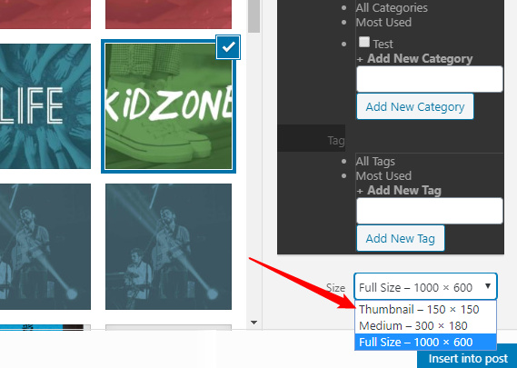
If you don’t want to upload the right size, at least choose the closest image size when selecting an image for the Image element. For you case, you can use the Thumbnail size.

image

You won’t need custom CSS if you use the right image size.

Problem 3

The content should be placed in 2 columns only and not row by row. Divide your content like the boxes in the following screenshot. When in mobile, that those columns will stack but will make sense.

image

Hope that helps.

Hi Christian, thank you so much for your help. I could solve problem 1 and 3 with your help! I still have not figured out how to solve problem 2 and where exactly i can choose the size of the image.

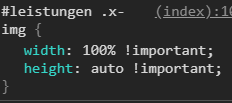
I do have those lines in my css
#leistungen .x-img{
width: 100% !important;
height: auto !important;
}
but don’t know how to make this work.

Hi @cs_film,

The current size of those images on desktop is 80px by 80px, you can use that value as max-width so the image will be limited to that max-width: 80px; only even on mobile. But you need to set your column’s Text Align to Center, to center those icons/images.

Cheers!

This topic was automatically closed 10 days after the last reply. New replies are no longer allowed.