At my website, on page https://exteriorrenderings.co.uk/#_Faqs
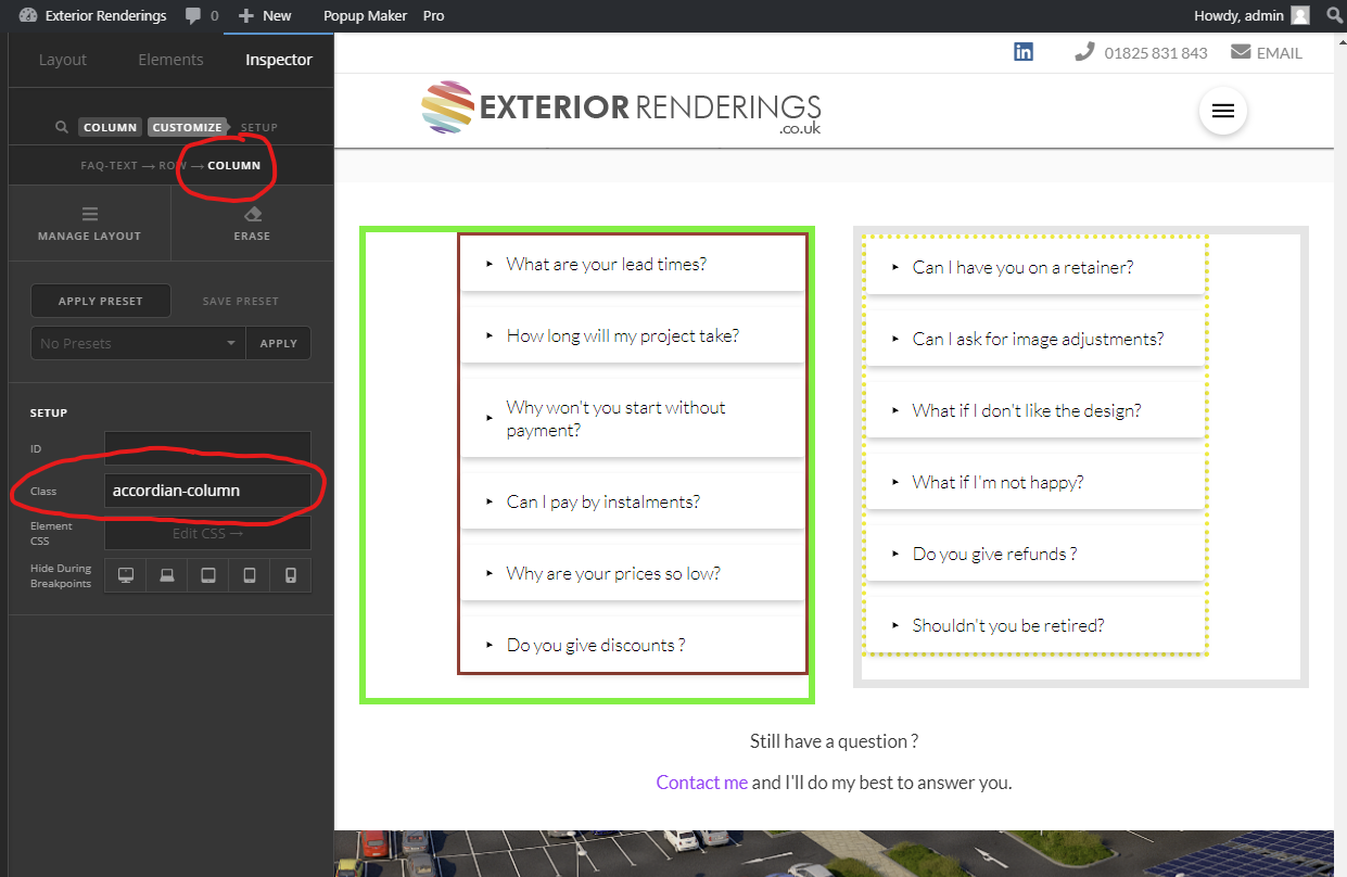
I have two Accordians in the same row and they seem to have the attributes Float Right and Float Left.
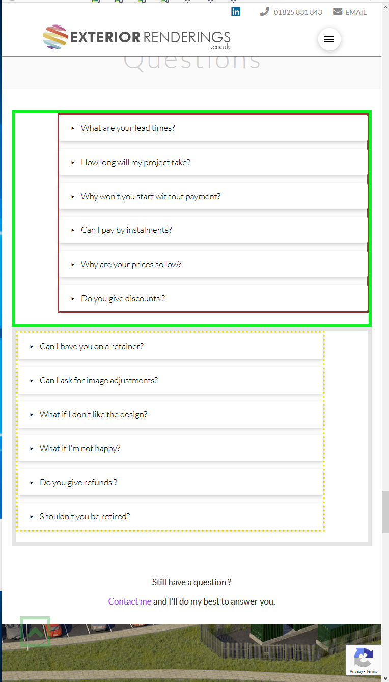
This looks fine when the screen is big enough, but when the screen is reduced to say mobile phone width, the alignment goes wrong.
How can I control the alignment of the Accordians, so that they are each in the middle of their respective columns ? So that when the screen size has been reduced they’ll align perfectly ?
I’ve coloured the borders of both the Accordians and their Columns as well to make things clearer.
Many thanks.