How to make a responsive Website

Hello,

I am almost finish creating my website and I thank you all of that. It is not live yet but pretty sure that it looks good now. The only thing that I don’t have is the responsiveness of the website to appear on any devices. The layout of the entire website was made using cornerstone with a very little css codes added to it.

I hope that you can now provide me guides or steps how to make it responsive now. I hope this will not involve major changes. I checked the ethos 3 demo and yes it is very responsive and I want my website the same responsive as that right now since you can not provide the expanded demo content then please help.

What I only want to have is the entire responsiveness that the ethos 3 demo content does offer. So I hope you can provide me the code if there is and guide me where it should be place. If there is an extension or plugins that must be use then please let me know.

I am hoping that all of you can help me regarding this.
Thanks a lot!
Hey @Freund,

X and Cornerstone are responsive out of the box. You don’t have to do anything. Ethos 3 demo does not have custom HTML or CSS. If you have mobile issues with your page, please give us the URL so we could see the setup and we can point you to the correct setup.

Thanks.

1 Like

Hello,

Okay, I understand now. So, I just want to check if this can also be achieve without using css code and can you please tell me how to do this?

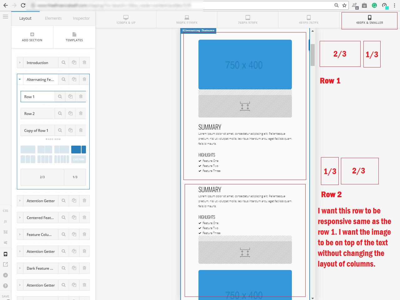
This photo I attached is the default layout of the ready-made templates on X. The template looks great on a widescreen resolution but when I checked it on a mobile view, there is something that needs to be change if I were to asked.

The columns of this section were inverted to each other. So, the left row is more dominant from the right. This is also the problem I have now because I can’t make my photos be on top of the text because it was placed on the right column of the row. Same as the default layout which seems to me not to good to see on a mobile view.

So, is there a way we can fix this? If there is a css code involve, please let me how to do it. I appreciate all of your effort in helping me.

Thanks!

Hey @Freund,

If I understand correctly, you want a column switch so that the right column displays on top of the left column on mobile? That is possible using the Hide During Breakpoints feature. Please see this answer from another thread.

If I didn’t understand the issue, please give us a bit more details.

Thanks.

1 Like

Hello!

Oh! It’s great! Thanks a lot! I’m very satisfied now! Hope liking your response could help you as well.

1 Like

We are glad that we could able to help you.

Thanks for choosing our theme!

1 Like

This topic was automatically closed 10 days after the last reply. New replies are no longer allowed.