Hey. I’m trying to achieve a visual effect and not sure how this plays out with the CSS. Figured the adepts at X-Theme would understand better than I the nature of X Pro (or X regular).
I’ve got this code going on with a certain category of posts ->
@media only screen and (max-width: 1300px) and (min-width: 1px){
.x-full-width-active .alignwide {
width: 88vw;
max-width: 88vw;
margin-left: calc(50% - 44vw);
}
}
@media only screen and (min-width: 1331px){
.x-full-width-active .alignwide{
width: 70vw;
max-width: 100vw;
margin-left: calc(60% - 44vw);
}
}
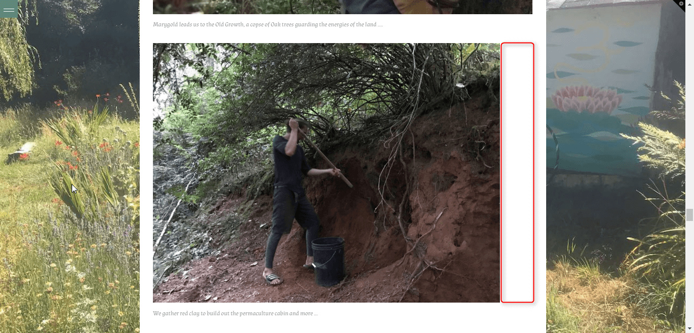
The idea is, how to make Images & Galleries, as well as Vimeo and other block-objects, fit within the container that’s been established, flush with the edge.
Here’s an example of usage -->
On an iPad or certain size screen as well as an iphone, the content is flush with the edge of the white container that holds the content. However, on a larger screen (and I suspect other screen sizes), it bleeds out. I got this code from WPMUDEV yet i’m feeling that support here would have a better sense of how things FIT into the X-Theme as said.
Is there a basic CSS that can be used that will achieve the effect?