How do you get buttons into 2 rows and columns and be responsive

Greetings again,

I’m essentially looking to put 4 buttons in a 2x2 block and grow and shrink according to screen size.

Summary
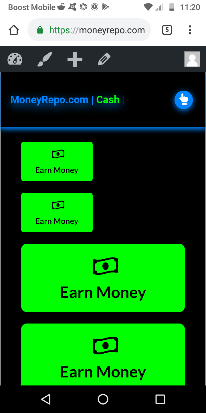
I’ve included a screenshot. ( Please delete when finished )

I used the pro editor to add a column with a half n half row but they still end up under each other.

I’ve really tried digging into the forums and experimenting. I even tried essential grid and the grid but neither had an option for buttons that I saw.

Or what I wanted to achieve that I could tell. Been working on and off on this issue for a couple days.

Really appreciate any help in this matter. Working from phone so makes some things tougher than I ever Remember on a PC before I became physically unable to use one. But I’m getting it done!

Couldnt do it without you guys and this amazing toolkit called pro theme. Thanks

-Chris
Hello Chris,

Thanks for writing in!

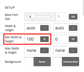
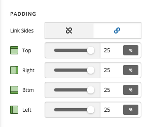
Regretfully we do not have a button element that will grow or shrink. Just create a section with two rows having two columns. In each column, insert a button element and then set the padding with percentage values. And also you can set the minimum width of the button to 100% so that it will occupy the whole column.

Button padding:

Minimum Width:

Hope this helps.

Than you very much for the swift reply.

I appreciate the information but this is similar to what I’ve already found. I’ve since tried playing with it more and still can’t get the buttons in half and half row.

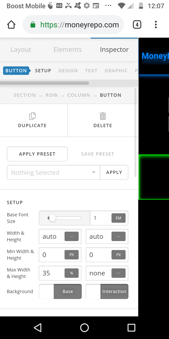
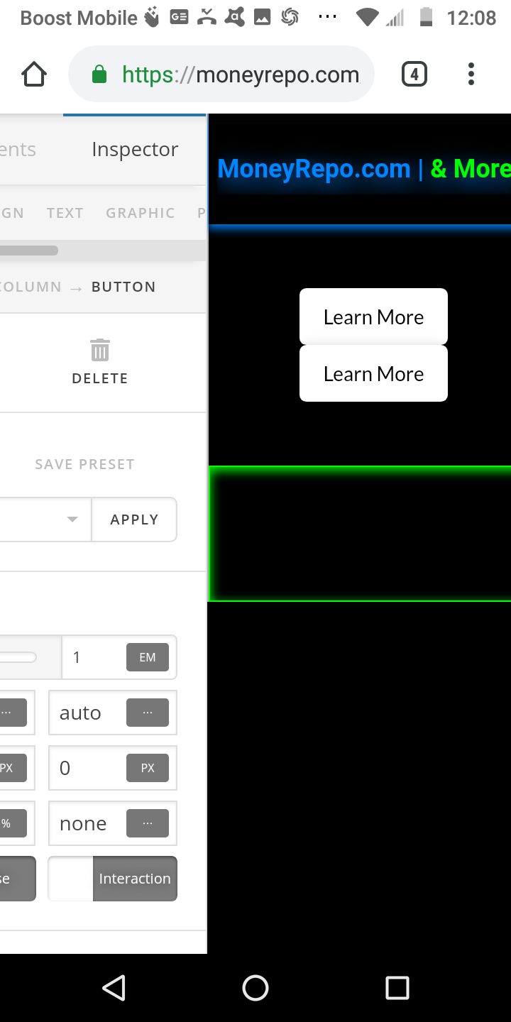
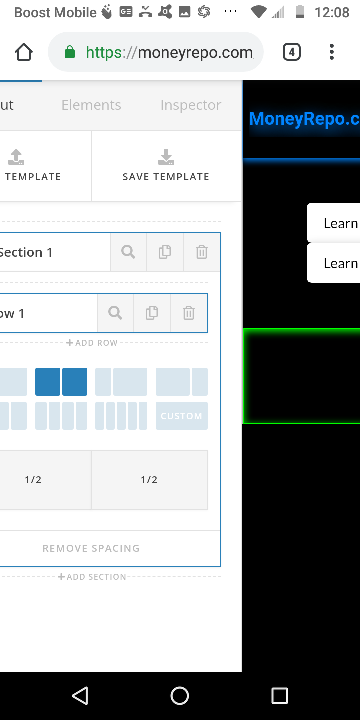
Including some screenshots for the last thing I tried and I almost did settle on single block stretched buttons but it didn’t look right to me or achieve the look I’m going for.

Really sorry I’m having such a time with this. Feel like I may just be missing something or not thinking of another solution. I figured using buttons in a 2x2 grid would be easier to achieve than I’ve found for what I’m trying to do.

Thanks again for your time and support

Hi Chris,

Regarding,

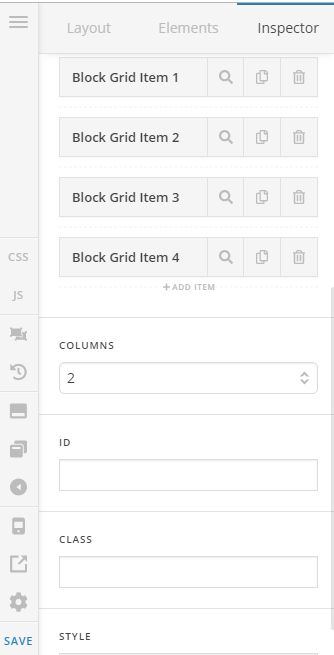
I think you’re looking for the Classic Block Grid element, please set your Section to 1 column only, and have your Block Grid 2 columns

You cannot drag an element inside this Block grid items so you need to use the button shortcode to put a button in there. This is a big catch here because you cannot style the shortcode buttons like a button element.

Now a couple of custom CSS to make this really work that suits your needs.

First, is to make the buttons inside the block grid to be 100% in width.

.x-block-grid-item .x-btn {
	width: 100% !important;
}

The second one is to make sure the Block Grid stays 2x2 on a small mobile screen (480px and below)

@media (max-width: 480px) {
	.x-block-grid.two-up>li {
		width: 47.5%;
		margin: 5% 5% 0 0;
	}
	.x-block-grid.two-up>li:nth-child(-n+2) {
		margin-top: 0;
	}
}

You can add custom CSS in the Page > CSS area

Hope it helps,
Cheers!

This was perfect. Thanks to this information I’m able to achieve exactly what I set out to do.

Really appreciate your help on this and I also really appreciate all the extensive documentation and support you have given others as it was also really beneficial.

Can’t wait until it’s all finished so you can see how it all came together. Thanks again.

-Chris

Hi Chris,

Thank you for your nice words and we’re glad we could help.

Cheers!

This topic was automatically closed 10 days after the last reply. New replies are no longer allowed.