I want to have a standard menu on my site but the hamburger that opens the menu, is it possible to do that?
Thanks
I want to have a standard menu on my site but the hamburger that opens the menu, is it possible to do that?
Thanks
Hey Lucy,
Do you mean you just want to have the mobile navigation always active without the hamburger icon on mobile?
If so, please add this code in X > Theme Options > CSS:

.masthead .x-btn-navbar {
    display: none;
}

@media (max-width: 979px) {
    .x-nav-wrap.mobile.x-collapsed {
        display: block;
    }
}
Hope this helps.
I want to to look exactly the same as the desktop version - so the
Hi Lucy,
This is not recommended as it will create layout issues in smaller devices, the menu items will drop down to second or may be to the third level of your header (see screenshot). This kills the concept of responsiveness, however if you need it for some reasons then you can add the following code in the Theme Options > CSS:
.masthead .x-btn-navbar {
    display: none !important;
}

@media (max-width: 979px) {
    .x-nav-wrap.desktop {
        display: block !important;
    }
}
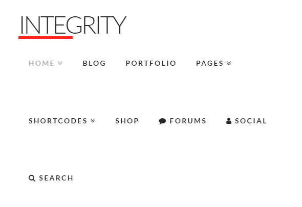
Hope this helps!
Ahh you’re right, I’ll leave it. Thanks though
You’re more than welcome,
Have a nice weekend.
This topic was automatically closed 10 days after the last reply. New replies are no longer allowed.