I would like the mobile website to look the same as the computer website.
Hi @sewedowhenu,
Thank you for reaching out to us. X and Pro themes are built as optimized as possible to work on mobile. Making the mobile version of the site similar to the desktop version would require disabling the responsive feature of the theme which is regretfully not possible at the moment as it requires rebuilding the css of the theme.
Thank you for understanding!
Nabeel,
Thank you for responding to me. I’m trying to get my woo commerce shop page to display more than one item on the mobile version. On the desktop view, it shows 3 items per row. On the mobile, one item per row. How can I get it to display more than one item per row on the mobile version?
Thanks
Hello @sewedowhenu,
Thank you for the clarifications. Please be advised that by default, the columns or product items will collapse into just one column in smaller screens. You’ll have to consider that on a desktop screen, it is wide enough of at least 1200 pixels wide while in most mobile screens, you only have 480 pixels. Having a 3 column width for smaller screens will give you problems later on. It will difficult to tap on the product items, the product images will become too small or the product titles will looked cramped and will not fit in the column.
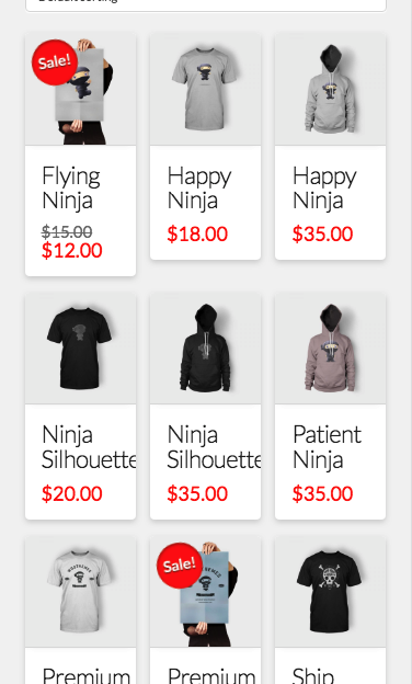
And if you still want to continue, you may need a custom css to do it to override or re code the styling of the product items.
Please note that custom coding is outside the scope of our support. Issues that might arise from the use of custom code and further enhancements should be directed to a third party developer.
Thanks.
This topic was automatically closed 10 days after the last reply. New replies are no longer allowed.