Hello
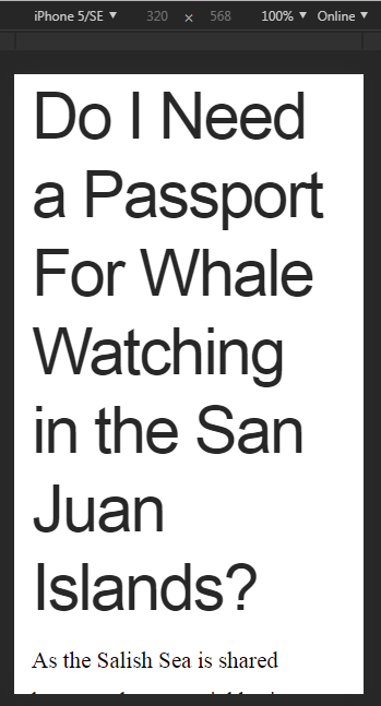
On mobile, my subheadings do not fit the screen properly. For example https://northamericanmammals.com/where-to-see-whales-in-san-juan-islands-and-puget-sound/
Some of the subheadings are off the page.
Please can you help?
Thank you.
Hello
On mobile, my subheadings do not fit the screen properly. For example https://northamericanmammals.com/where-to-see-whales-in-san-juan-islands-and-puget-sound/
Some of the subheadings are off the page.
Please can you help?
Thank you.
Hi Bryan,
Thank you for writing in, even though the headlines on that page are huge I don’t see it getting off the page on my end.
You can configure the Root Font Size feature under X > Theme Options > Typography to adjust your text/title size in specific breakpoints.

Each of those value XS (extra small), SM (small), MD (medium), LG (large), and XL (extra large) represents a screen width, so you would want to set a smaller value on XS and SM, and higher (not too much) value on MD, LG, and XL.
Now, all the common text/headline of the site will be base of those values, and Then on your elements, you can use the rem unit, rem Units Along with Differing Root Font Sizes you can set different root font sizes for each breakpoint of the theme, which allows all text across your website to be responsive. Remember, you are setting the base sizes for your theme overall, so this will affect everything, but starting with larger numbers on desktop and going to smaller values on smaller screens will help the overall responsiveness of typography on your website. Then, you can utilize rem units in the builders to scale text up and down based on the root font-size.
X / Pro Stepped Font Size Demo
Hope it helps,
Cheers!
This topic was automatically closed 10 days after the last reply. New replies are no longer allowed.