In general how do I target elements when at different break points? I am able to use the visual composer to drag, drop tweak css etc. for desktop, however when I view my sites in mobile it is clear that things need tweaking or removal altogether, or adding things. I would like to know how I would access or target things in media queries, or if there is a simpler drag’n drop kind of way. Also if you have any documentation on this that would be helpful. I know it is wise to design for mobile first, though I don’t think that is an option here (x-pro). Thank you.
Hey there,
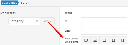
In Pro’s header and footer builder, Bars, Containers and all Elements have a Hide During Breakpoints option under the Customize tab you can use to hide anything under a certain breakpoint.
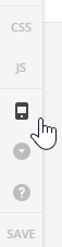
You can use the Preview Resizer in the main builder controls.
Mobile First is not an option but a design concept / strategy. You can do that in any responsive theme especially with X and Pro where you have responsive options.
Thanks.
Thank you! This was most helpful.
You’re welcome.