Homepage menu is gone from mobile and broken on desktop

I was working on my homepage today and suddenly the menu is gone from mobile site and there’s a huge gap on the desktop. I have no idea why, I was only creating new sections and editing text, I never touched the backend code. This is only a problem on the homepage

Also the sections are stacked vertically suddenly instead of 3 in a horizontal row

Hello Shannon,

Thanks for writing in! Did you change the stack of your site? By default, the color of the mobile menu button is white. In the built-in Ethos style.css file, it is using the following CSS:


.x-btn-navbar:hover {
    color: #fff;
}

.x-btn-navbar.collapsed {
    color: #fff;
}

.x-btn-navbar.collapsed:hover {
    color: #fff;
}

Feel Free to modify this code and add it in into X > Theme Options > CSS .

Be advised that you will have to maintain this code.

Best Regards.

I haven’t changed anything to the code. Awhile ago I had the same issue where the dropdown menu was way away from the top and the mobile hamburger menu wasn’t showing up, so they went in and changed a bit of code and it worked. Now the problem is back but it’s only on the homepage, not the other pages. I didn’t change the stack of the site, the only thing I was doing was updating content on the homepage. Plus the images have jumped out of the rows and are all vertical. Not sure what’s going on?

Hello Shannon,

I have logged in and I found NO issues in your installation. This could just be a caching issue. And also I noticed that you are using CloudFlare. Right after your updates, please log in to your CloudFlare account and purge your site cache. You also need to regenerate the minified CSS and JS files in CloudFlare.

Kindly let us know how it goes.

I tried whatvyou said and it didn’t work. The problem is only on the homepage

Hey Shannon,

Sorry for the confusion. No CSS is required for this except for overriding the color of the Mobile Nav Toggle because the Ethos Stack is a magazine-centric theme so the usual design or color of that is light on dark background. So for your case, because the Mobile Nav Toggle is white and your header background is also white, you won’t see the toggle. It would be best that you change your header background to a dark color so you won’t need any CSS code.

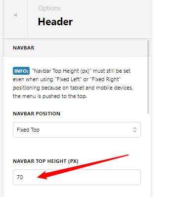
Regarding the space below you menu items.

You don’t need CSS for it. Just change the Navbar Top Height to a lower value like 70.

image

Going back to the header, if you wish to continue using a white header background, you will need custom CSS as said above. There’s a problem though. Because there’s a custom CSS syntax error somewhere in your home page, CSS placed in the Global CSS won’t work. We cannot find the said broken custom CSS as that would be beyond the scope of our theme support.

That said, the following code needs to be added both to the Global CSS and your home page’s Content CSS. I’ve tested this and it works.

Please just note though that custom coding or theme customization is outside the scope of our theme support. If you will encounter issues resulting from the use of this code and/or would need further adjustments, you need to hire a developer.

.x-btn-navbar {
    color: black;
}
.x-btn-navbar:hover {
    color: black;
}
.x-btn-navbar.collapsed {
    color: black;
}
.x-btn-navbar.collapsed:hover {
    color: black;
}

Hope that helps and thank you for understanding.

This topic was automatically closed 10 days after the last reply. New replies are no longer allowed.