Home page looks great on computer but something is wrong with mobile views

http://www.dev.graycocommunications.com/

I am unsure what I have done wrong to have my site look so bad on mobile devices/portrait views. Everything looks HUGE. A single letter takes up the entire screen. I hope someone can advise on how to correct it.

Thank you in advance.
Hi @Suzanne,

Thanks for writing in.

I can confirm that I could see huge texts when using mobile on your setup. This could be because of your Custom CSS or there is a plugin that causing this. I could give you custom CSS to fix it however this could be the best option to fix it So please try to remove any custom CSS for fonts and plugin that you have so that you can see where to adjust.

Let us know how it goes.

Thanks.

Thank you for your help, @Nico.

Installed plugins are Akismet, Gravity Forms, SG Optimizer, Wordfence, and Yoast. Disabling them all did not change the size to normal.

Additional CSS on the site: .single-post .entry-featured {display: none;}. Deleting additional CSS also did not change the size to normal.

If you could provide custom CSS to fix the issue I would be very appreciative.

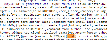
The issue is coming from this code.

html {
    font-size: 166px;
}

It’s coming from your custom CSS. Please remove it or remove all your custom CSS then clear all caches including your browser cache.

Thanks.

I fixed it! While customizing the typography to 16px, I accidently added an extra 6. Thank you all for your help.

You’re welcome. Glad we could help. :slight_smile:

This topic was automatically closed 10 days after the last reply. New replies are no longer allowed.