Hollow Icons Look Wrong in X-Theme

Hello,

on my site, when I use “hollow” icons, they look wrong. They are merely a reversed version of the original icon, instead of the real FontAwesome icon it’s supposed to be. I made an example page, to show you what the problem is and placed the icons on my site next to a screenshot from the X-Theme documentation for icons.
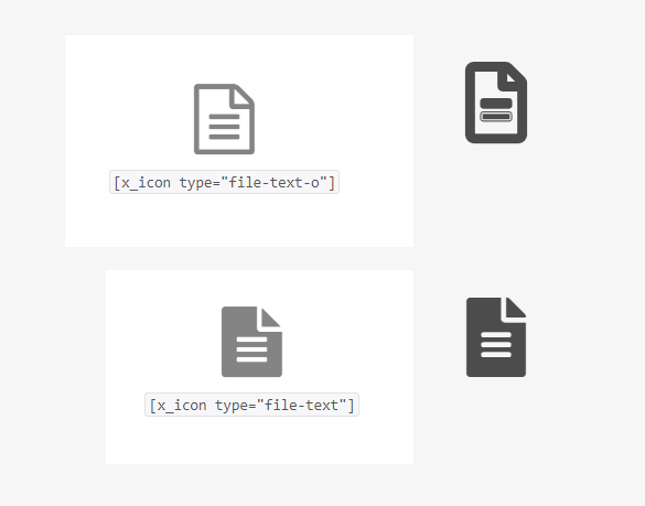
As you can see, the filled icons look just fine, but the hollow icon is kind of broken. Can you help me with this?

Hi Matthias,

Thanks for reaching out.

That’s the icon for FontAwesome 5.0 and basically different than the previous versions. Both are correct from the versions they are being used. The light version (thinner) is only applicable for FontAwesome Pro.

Please check it here https://fontawesome.com/icons?d=gallery&q=text%20file,

And this is the old fontawesome https://fontawesome.com/v4.7.0/icon/file-text-o

Thanks!

This topic was automatically closed 10 days after the last reply. New replies are no longer allowed.