Hide Single Megamenu Nav Link on Mobile

Under Products in my pro mega menu (not using plugin) I have a link that i don’t want displayed on the mobile. I have an image under that link that I already head on mobile, but I want the entire section gone.

It already has a class that enables the mega menu, so i’m not sure how to handle it with classes. I didn’t think I could apply more than one class to something.

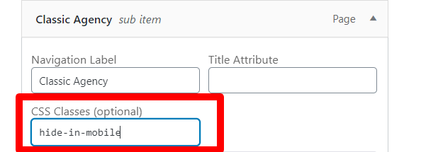
Hi Jesse,

Thanks for reaching out.
You can achieve that by adding a custom CSS class into the menu item and later on by adding the following code at Theme Options > CSS.

Menus—-WordPress

.x-navbar .mobile .x-nav .hide-in-mobile
{
    display: none;
}

Remember that the above code will work if copied as it is and don’t conflict with any existing style.
Please note that the code provided serves only as a guide to help you get started custom coding on your own if there’s no option offered in our theme or the products we bundle.
We do not provide support for custom codes that means we can’t fix it in case it conflicts with something in your site nor will we enhance it.

Thanks

As i mentioned, the item already has the mega menu class on it, how can i add two classes? Is that a thing? is that possible?

Hi Jesse,

It seems no custom class has been added through the process I have shown in the last post. If you have that option and already added a class, you can another by adding a single space between two classes.
If you are not able to find the option to add the class in the Menu Item, just go to the Screen Option at the Right Top of the page and select the CSS Class option. Please find the screenshot and video explaining the settings.

https://www.awesomescreenshot.com/video/1363798?key=8865fc3e30fac85bff67ec919326372e

Hope it helps.
Thanks

This topic was automatically closed 10 days after the last reply. New replies are no longer allowed.