Hide during breakpoints not working on smartphone and tablet views

Hi,

I use PRO theme.

When using hide during breakpoints the rows that I am hiding so that I can have a different layout for phones don’t disappear. in the Smartphone and tablet views.

Even though I have clicked the button to hide them.

Thanks in advance.
Hi Niall,

You could try testing for a plugin conflict. You can do this by deactivating all third party plugins, and seeing if the problem remains. If it’s fixed, you’ll know a plugin caused the problem, and you can narrow down which one by reactivating them one at a time.

If that doesn’t help, please provide us your wordpress admin login in Secure Note

Thanks

Hi Paul.

thanks for the swift response

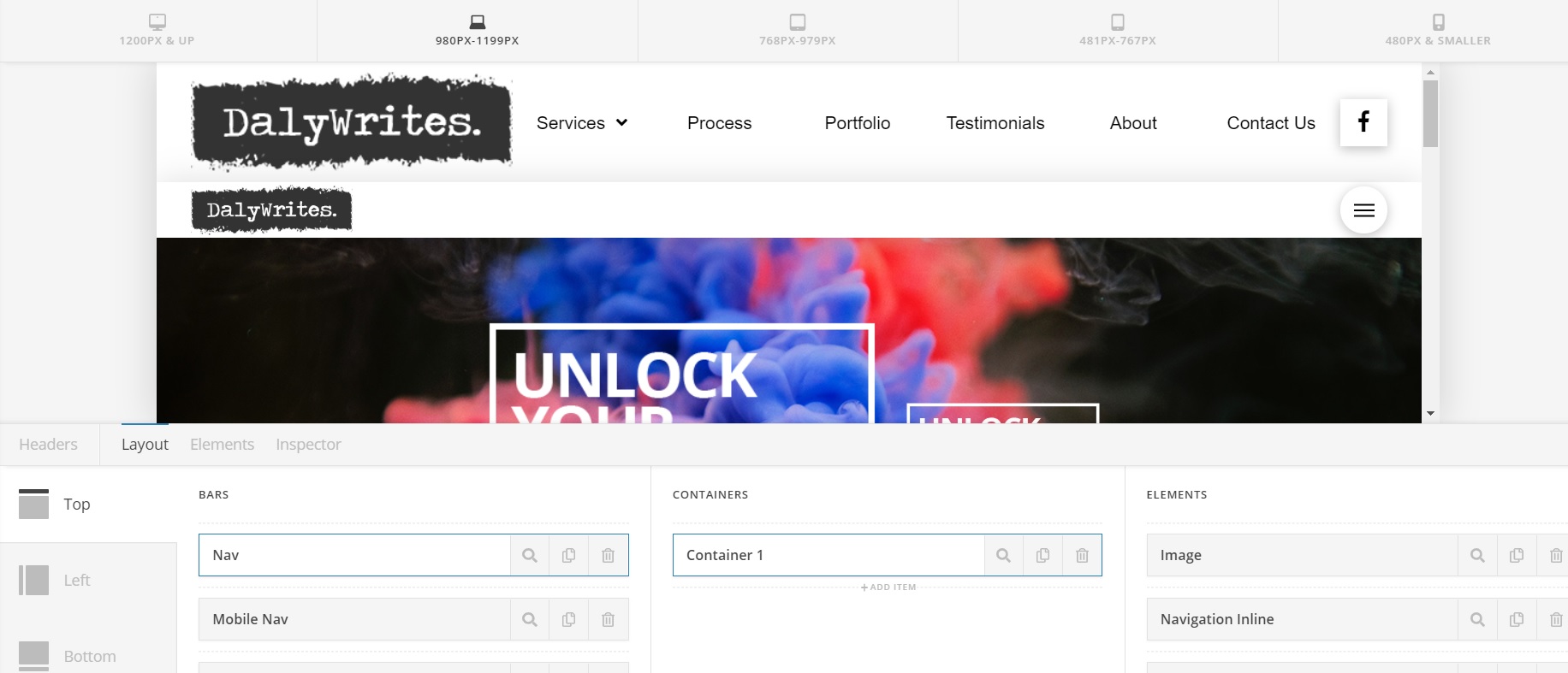
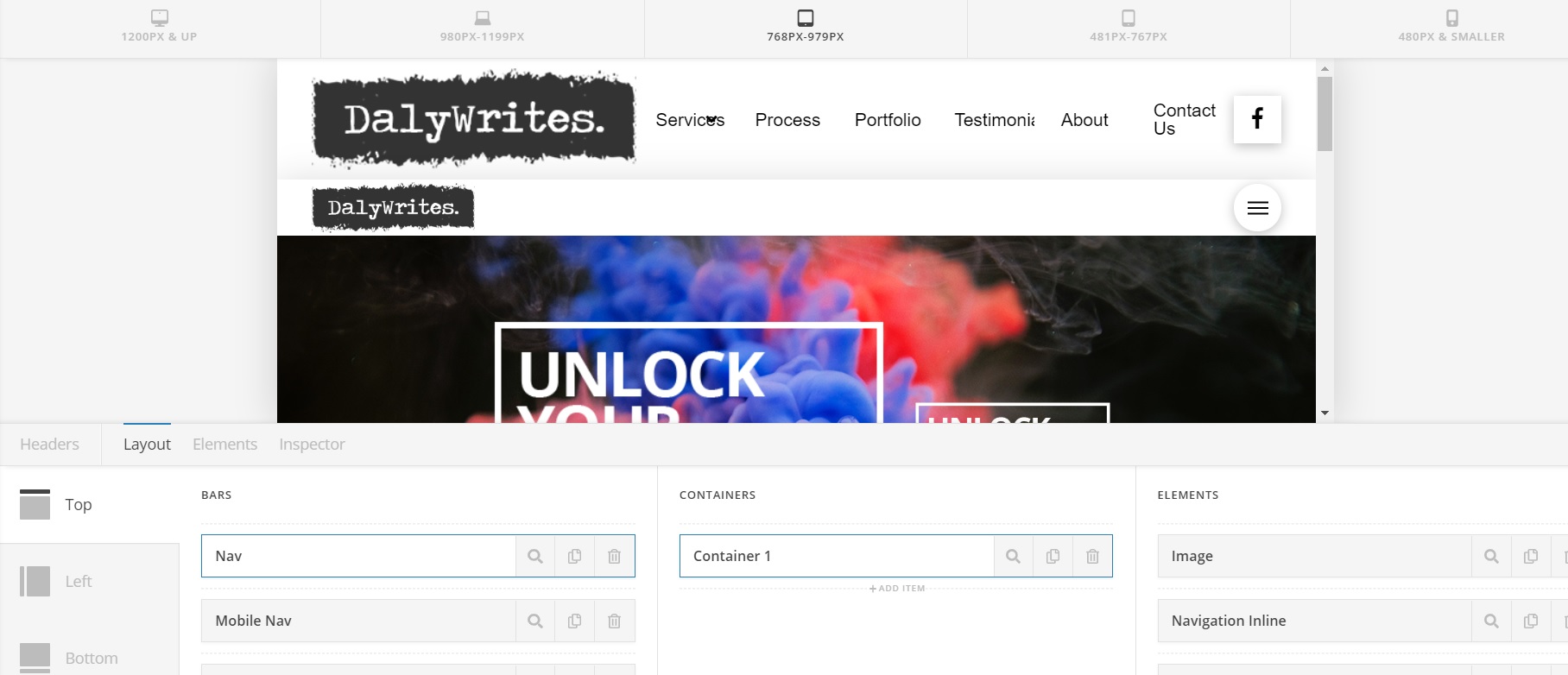
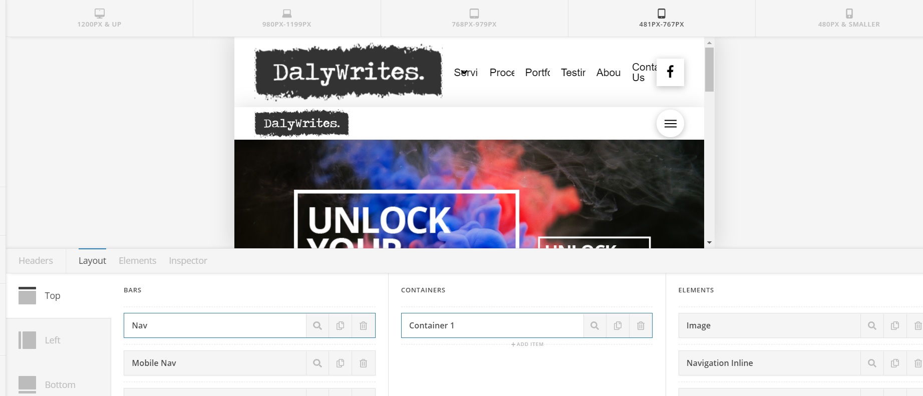
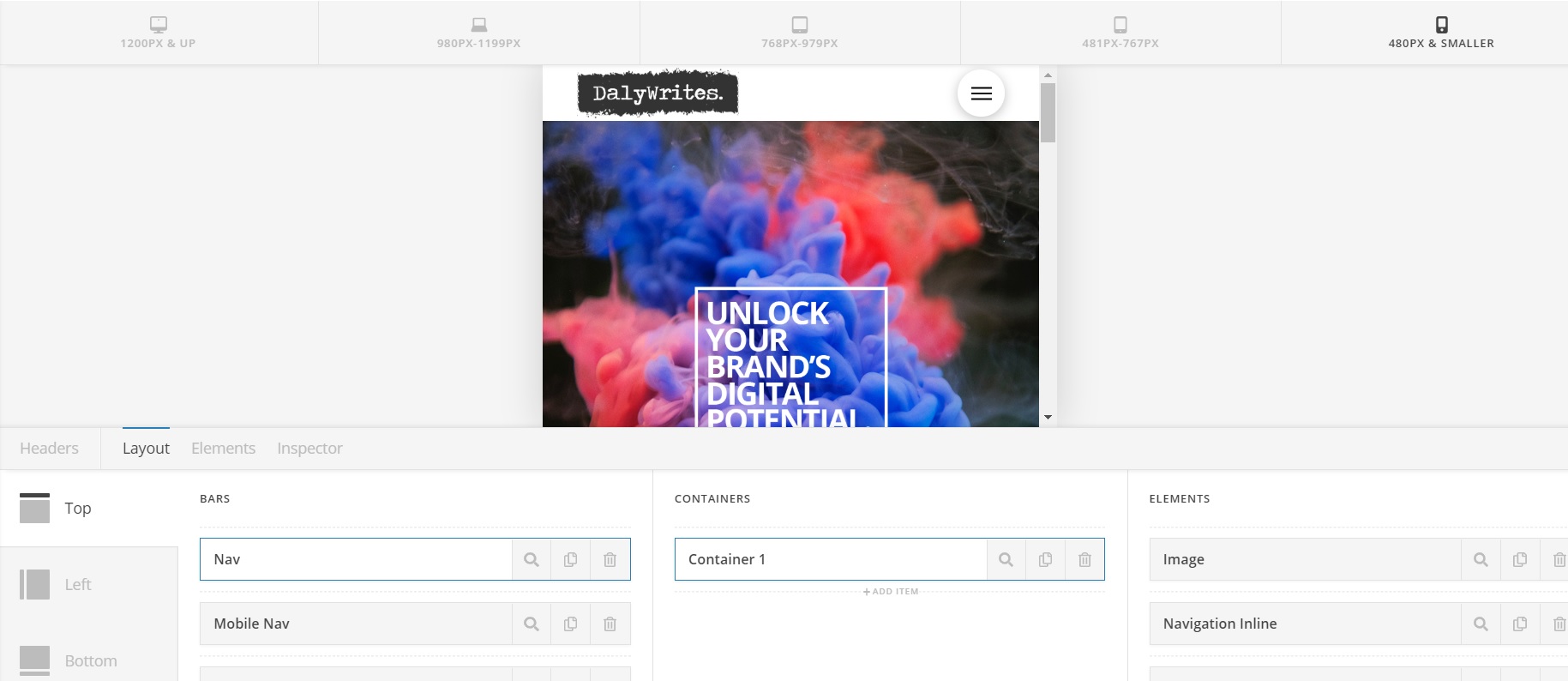
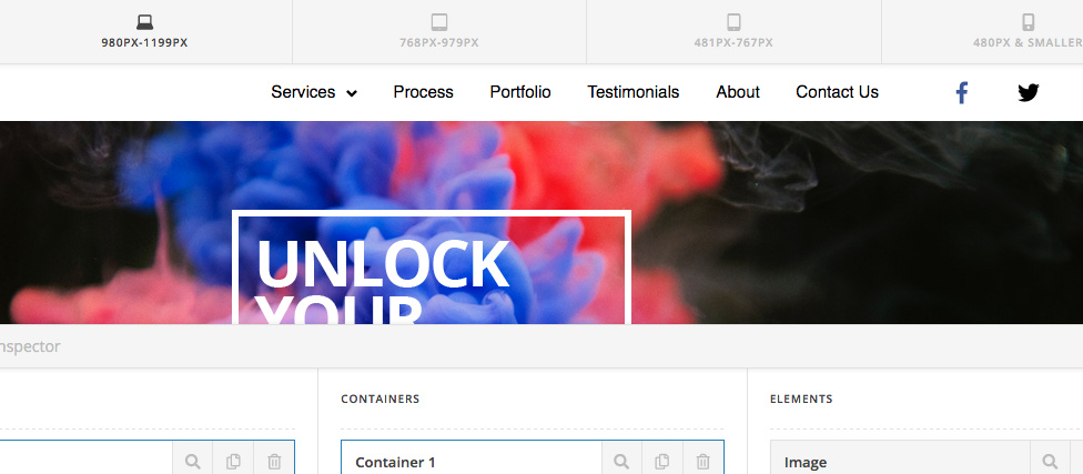
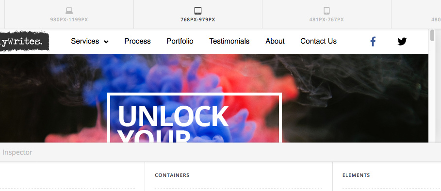
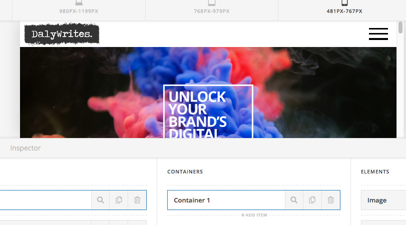
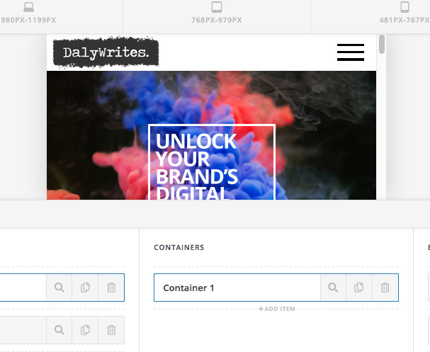
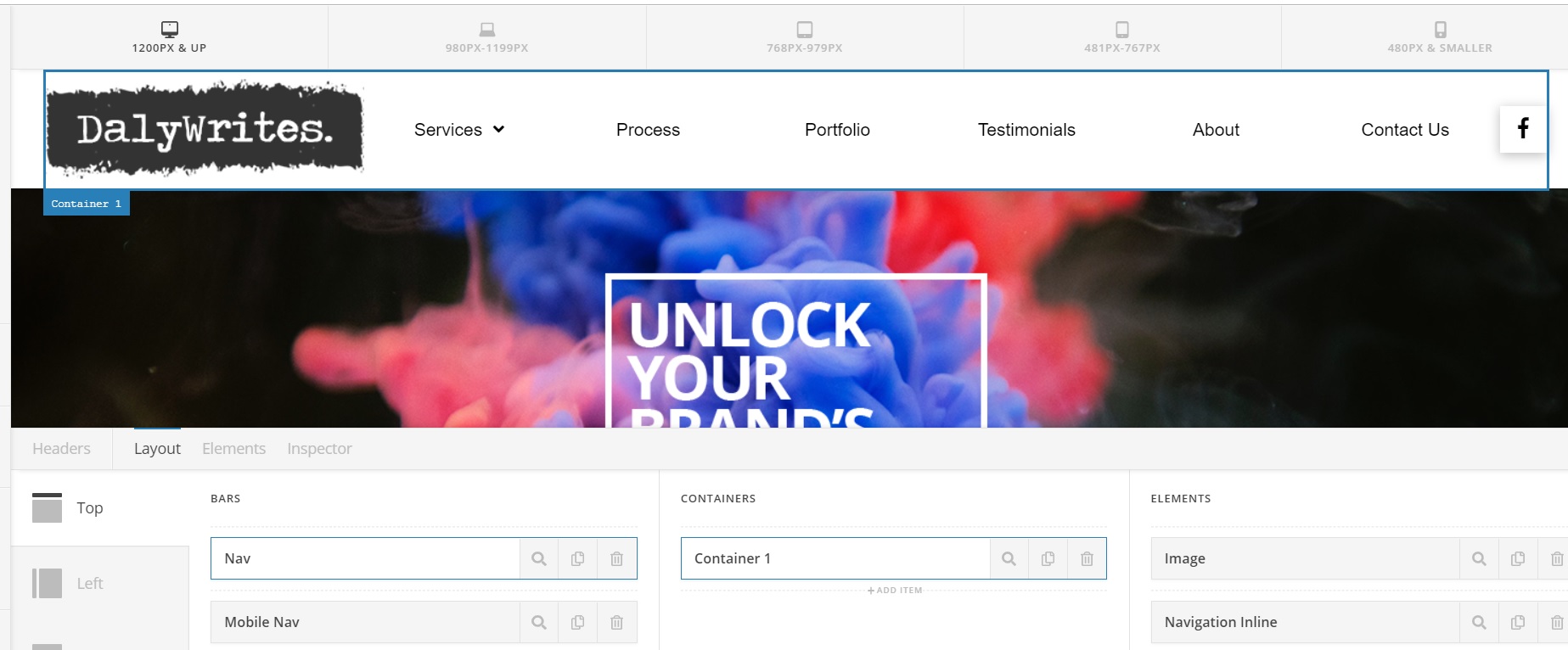
I have tested all the plugins but have had no luck I have attached some pictures to further explain the issue.

I have built a standard nav in a bar but also built a mobile nav in a bar.

I have clicked hide the bar on the Mobile Nav on the on XL, L, M, S and left it viewable on XS

However L, M and S still have both Navs

I have put my wordpress admin login in a Secure Note

Hi Niall,

I can’t replicate the issue on my end. Please try to clear your browser cache and plugin cache then check again.

Thanks

Hi Paul,

That is really strange. it is still the same on mine.

Any other ideas?

Hi Niall,

I’m a different staff tested your issue using different browsers, but I could not experience such issue.

So it should be a caching issue on your end. Could you please try using another browser and re-test your issue further. You can also use Incognito mode on Chrome (https://www.lifewire.com/incognito-mode-google-chrome-4103635) or private browsing mode on Firefox (https://support.mozilla.org/en-US/kb/private-browsing-use-firefox-without-history) to avoid caching.

Let us know how it goes.
Thanks!

This topic was automatically closed 10 days after the last reply. New replies are no longer allowed.