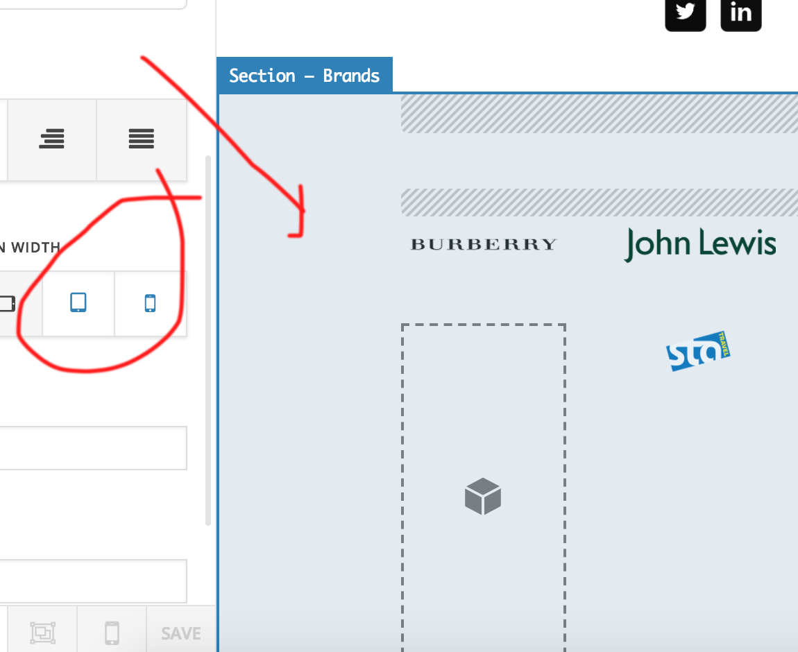
Hide based on screen width

Hi there,
when I set a section with rows in to hide on screen width, for wider devices when i shrink screen down to a smaller size I can’t see the rows?

Site is
http://www.dannyhearn.me (on homepage)

Summary

Rows are in ‘Brands’
Row 4/5 are set to only display on 481px – 767px and 480px & Smaller
However they are not visible when shrinking screen

Hi There,

Thanks for writing in!
every responsive breakpoint having there maximum and a minimum of screen width, beyond that it should show.

I can see your complete section is set as not visible on a mobile device, which is causing the issue.

Hope this helps!

Thanks

ahh perfect I hadn’t realise i’d set it at that level

You’re more than welcome, glad we could help.

Cheers!