Hide based on screen width suddenly stopped working

A website I recently built for a client has suddenly had all the pages with “Hide based on screen width” stop working.

I have set certain sections to hide based on screen width, to get a better mobile look - and suddenly, they are all showing regardless of screen width! - this was working fine a week ago.

When I look at the pages in cornerstone, the sections are definitely set correctly (this hasn’t changed) - but they just no longer hide at screen widths.

I will send the login details in next post - please look at the first page (Australian Made) - this shows you the issue I am having.

Client is quite upset about this suddenly happening - I need to fix this ASAP!

Darren.

Hi Darren,

The issue is because you have overridden theme CSS on your child theme style.css file. See this: https://screencast-o-matic.com/watch/cbQjjRI6IW
Remove the following custom CSS from your child theme style.css file:

.cs-hide-lg {
  display: block !important; 
}

Hey Lely,

Thanks for the video in the reply - very professional! :slight_smile:

I can’t seem to find this line of code in my custom CSS Style sheet:
.cs-hide-lg {
display: block !important;
}

Regards,
Darren.

Hi there,

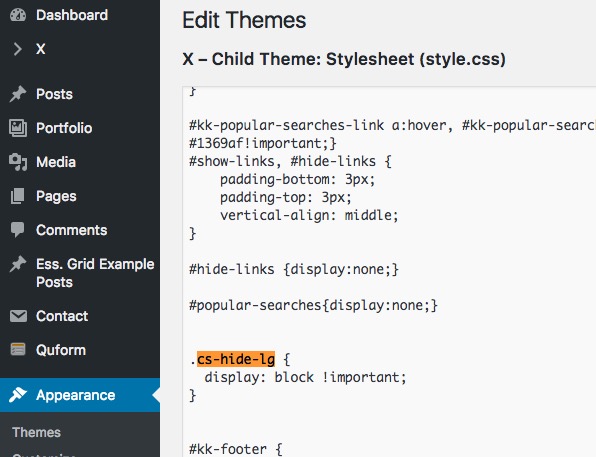
I went to Appearance > Editor and clicked in the Style.css file and searched for the code and find it:

Kindly remove that section of the code.

Thank you.

Ahhh - got it.

I wasn’t aware there was another CSS file that I could modify.

Problem is fixed now, thanks again for all your help.

Cheers,
Darren.

Hi @DesignMunky,

Happy to hear that.

Feel free to ask us again.

Thanks. :slight_smile: