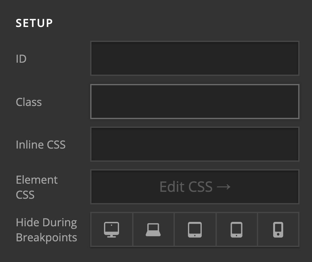
Hide Based on screen width option is missing

Hello,

I’m trying to make a responsive section with a row and two columns. The problem is that the option to hide based on screen width is not available for either the section/row or any of the sub-elements… For classic row it is an option, but I can’t use a classic row… How am I supposed to make this responsive?

Thanks.

Hi there,

The ID, class, hide during breakpoint, and other settings are in the customize option of the elements and the section, rows, and columns.

Hope this helps.

Awesome, thank you!

We are delighted to assist you with this.

Cheers!

This topic was automatically closed 10 days after the last reply. New replies are no longer allowed.