Hello ThemeCo.
I’m optimizing my website for mobile, but can’t find the HIDE BASED ON SCREEN WIDTH part, since the last update.
Can u help me with this?
Thanks in advance.
Hello ThemeCo.
I’m optimizing my website for mobile, but can’t find the HIDE BASED ON SCREEN WIDTH part, since the last update.
Can u help me with this?
Thanks in advance.
I came here for the same reason, when creating a new Row the “Hide Based on Screen Width” buttons aren’t there anymore. But they are in the classic element rows. Please help. Thanks.
They are in the classic elements row? where can i find that please
thanks man.
I can’t find it either, I only see it on pre-existing rows labeled as classic. 
Hey Guys, I found it! Click on your Section and look near the top left of the inspector… you’ll see a little search glass. Click on that and type Hide. The option will appear. Still can’t find it in a more traditional sense, but in a bind it works for me.
Cheers!
But Sadly, It doesn’t work… Now I get 2 sections on mobile instead of 1 hiding.
I found it 
when you’re in the row or section you want to edit , click on customize near setup and design.
There you can edit the hide during breakpoints .
Thank you!!!
They hid that pretty well.
Hello guys,
Glad to see you managed to find.
For the others who are searching for the styling, class, id boxes and hide based on screen width options they are all on the customize tab.
Please see image :
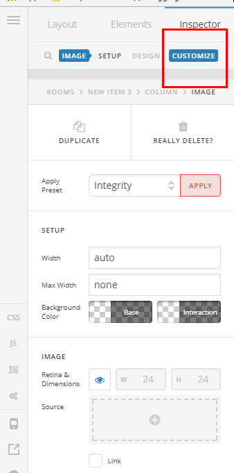
Hope it helps
This topic was automatically closed 10 days after the last reply. New replies are no longer allowed.