Hi there, how would I go about hiding a n element on a mobile, and showing it on a desktop and vice versa.
I have this setup:
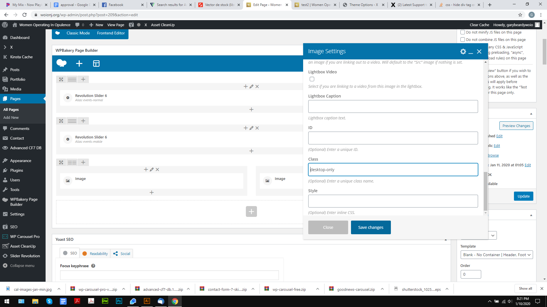
And this:
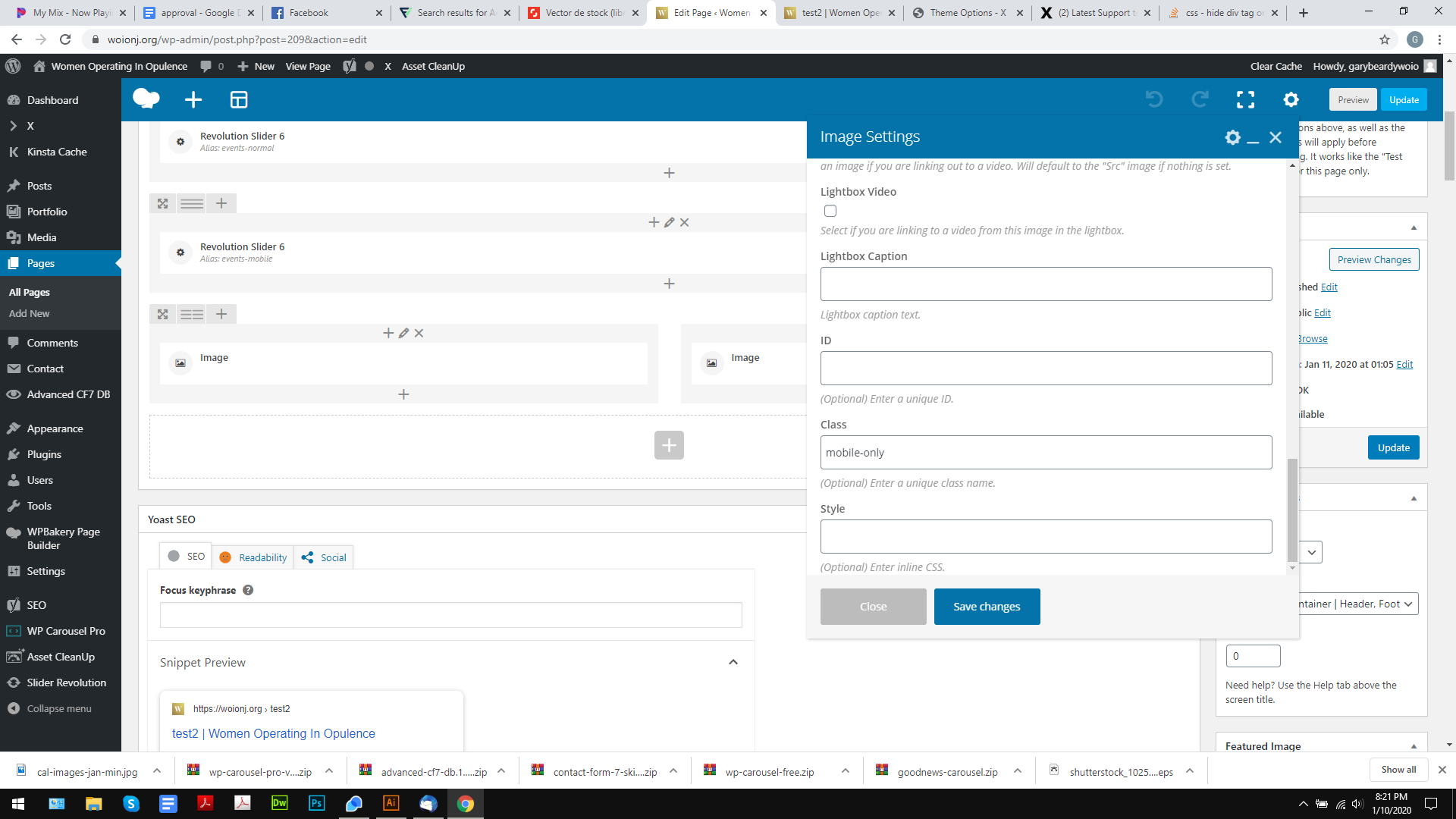
Ad this code:
}
@media (min-width:600px) {
    .desktop-only {
        display:block !important;
    }
}
@media (max-width: 600px) {
    .mobile-only {
        display:block !important;
    }

    .desktop-only {
        display:none !important;
    }
}
Yet it doesnt seam to be working for the desktop view, mobile is, but its showing both on the desktop.
Any tips on how I can make it work?
Thanks.