Help with styling

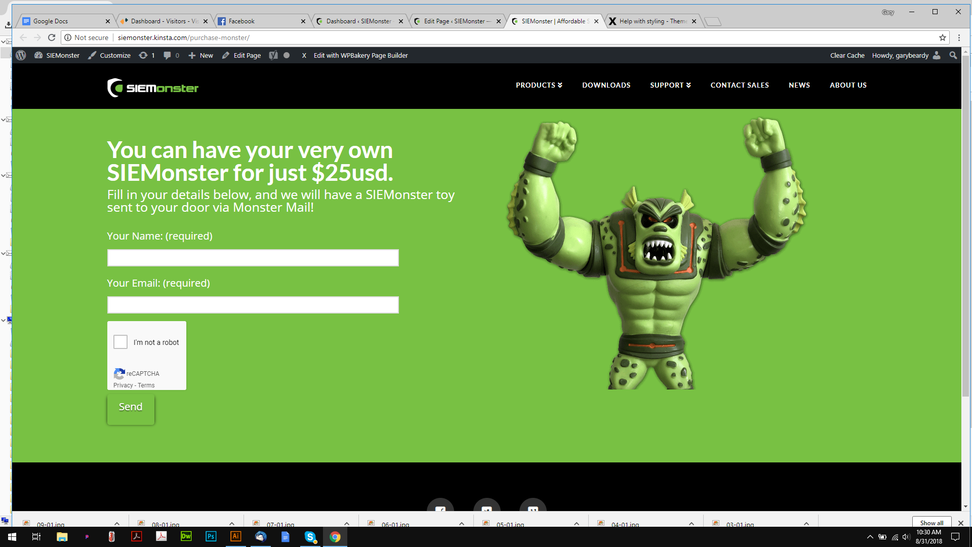
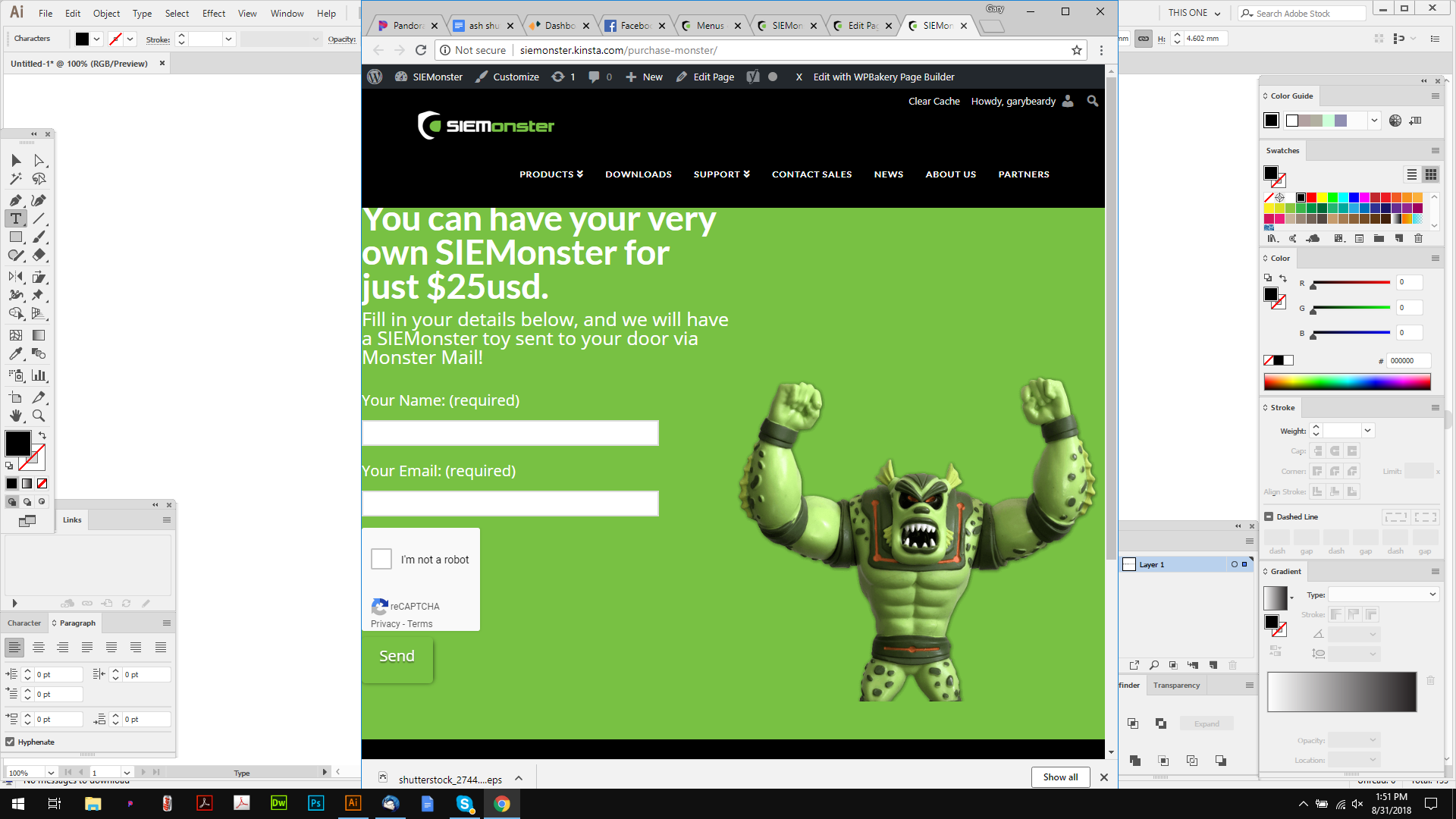
Hi, sorry ti bug, its probably a quick fix:

I need that Monster to sit flush to the bottom edge on all screens, it works on the desktop, but not on mobiles or ipads etc…

Also, can we make it stack on a vertical ipad, it only stacks on a mobile, and shrinks the monster image too much.

Thanks.

Hello @logoglo,

Thanks for asking. :slight_smile:

As you have already added class name, all that needs to be done is add following CSS under X > Theme Options > CSS:

@media only screen and (max-width: 600px) {
    .x-img.monster2 {
    position: absolute;
    bottom: 0;
    margin-bottom: 0;
    width: 200px;
    right: -50px;
}
}

I have found the proper CSS code selector using the Chrome browser Developer Toolbar:

For the CSS code itself, I suggest that you get started with this tutorial:

Thanks.

Hi there, sorry, but that didnt work :frowning:

Hi again,

Try this, enable Marginless Columns option via Row Settings (see screenshot)

Then in the last column that has the image add the following CSS rule in the Element CSS field

$el {
  vertical-align: bottom !important;
}

Hope this helps!

That didnt work either (btw I use visual baker)

This was doable on the homepage (scroll down) so it should be doable here right?

Thanks.

Hi @logoglo,

In that case, turn on the Marginless columns option of your content band, then add vertical-align: bottom !important; to Style input field.

Thanks!

Still not working. Please see the monster toy at the bottom of the homepage, I want this to act the same (but with an all green background as I have it now)

Thanks.

Hi again,

Please add the following code in the Theme Options > CSS:

@media screen and (min-width: 768px) {
   .page-id-2553 #x-content-band-1 > .x-container {
        display: table !important;
        padding-bottom: 0 !important;
    }

    .page-id-2553 #x-content-band-1 > .x-container > .x-column {
        float: none;
        display: table-cell;
        vertical-align: bottom;
    }

    .page-id-2553 #x-content-band-1 {
        padding-bottom: 0 !important;
    } 
}


@media screen and (max-width: 767px) {
    .page-id-2553 #x-content-band-1 {
        padding-bottom: 0 !important;
    } 
}

Hope this helps!

That did the trick! thanks.

You are most welcome. :slight_smile:

This topic was automatically closed 10 days after the last reply. New replies are no longer allowed.