Hello,
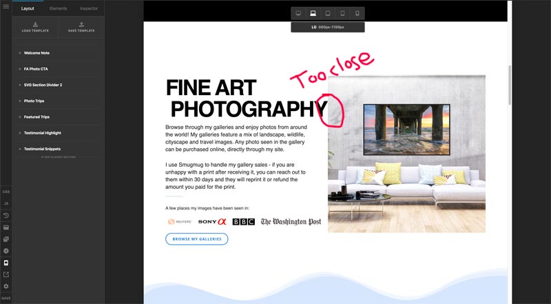
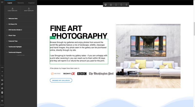
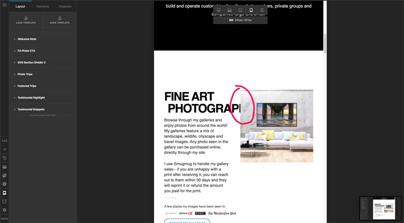
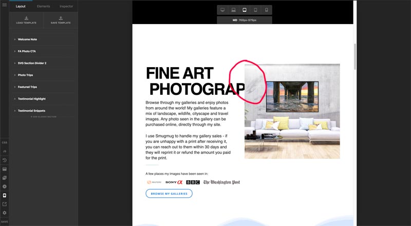
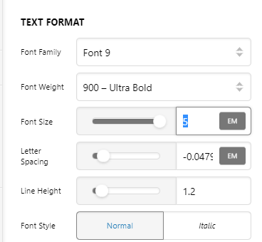
I used your design cloud - blueprint creative columns 5 template to build a section on one of my pages. It worked out great except for the size of the headline in that section. At the largest screen size everything looks perfect and I’d love to be able to keep it that way at that breakpoint. The problem is that the headline doesn’t seem to adjust as the breakpoints get smaller and the headline then either gets too close to the adjacent column or moves behind it and gets cut off. I’m guessing there’s a calc formula that can be used for the font size to keep it looking balanced as the site gets viewed at different breakpoints, but it’s beyond my scope of knowledge. I’ve attached screen shots and login info, any help would be appreciated!
Thanks,
Dave