Hi there,
Just wanted to see if I could get help with sorting out my site (waltonmaslow.com) for mobile - it looks terrible!
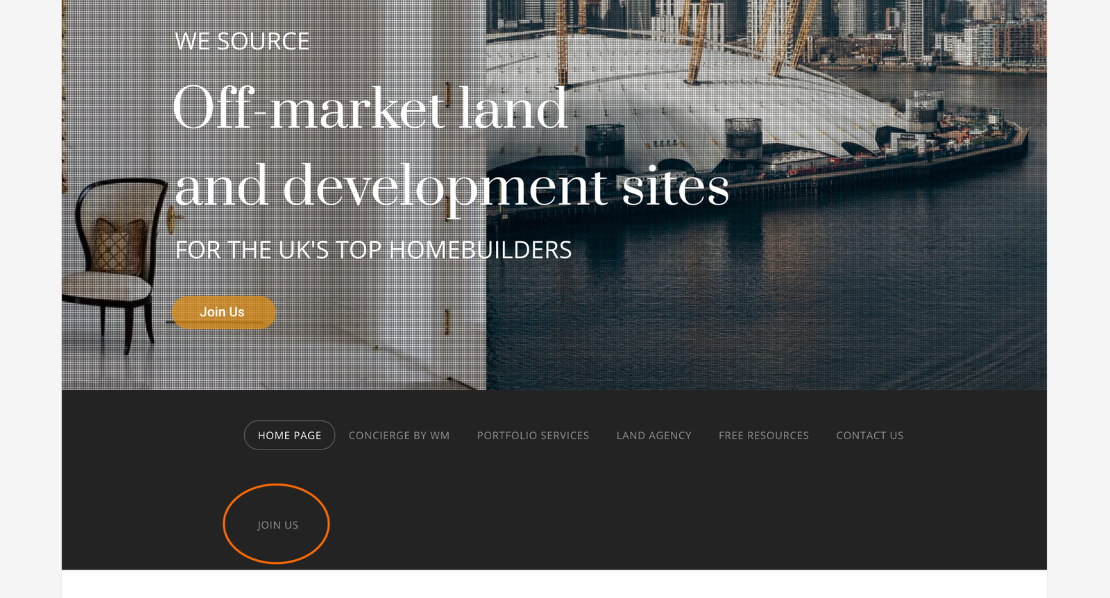
The nav bar area needs the following changed:
- Fixing the spacing between the button/revolution slider and the nav bar
- Lowering the height of the nav bar - looks totally disproportionate to the slider
- Moving the menu lines to the left and making it white

Add the body needs the following changed:
- Moving the image to the centre
- Fixing the text so it’s in screen width
- Put space between the image and the text

Unfortunately, I haven’t got a clue about how to do either!
Any help would be much appreciated, thanks