My headline icons keep sliding into the headline text once the screen size start to shrink. How do I resolve this?
Thanks!
My headline icons keep sliding into the headline text once the screen size start to shrink. How do I resolve this?
Thanks!
Hi,
Thanks for writing in! To assist you with this issue, we’ll first need you to provide us with your URL. This is to ensure that we can provide you with a tailored answer to your situation.
Thank you.
Doh! Sorry about that.
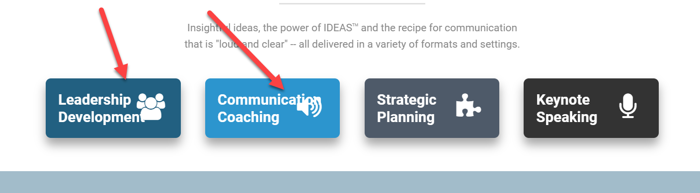
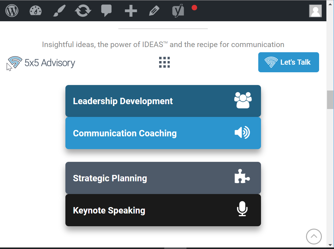
Also, how do I insure that columns have a space between them when they are flexed on the mobile screen? On the larger layout, the margin/padding settings I have display it correctly. But, when it compresses and flexes, the columns get scrunched together when displayed vertically like in these 2 examples from my homepage:
Hi There,
Could you please try adding the following CSS rule into your page’s custom CSS area and see if that helps.
@media(max-width:480px){
  .x-container .x-column {
    margin-bottom: 10px;
  }
}
Hope that helps.
I put that code into the global theme options/css since I would want that fix for any and all pages, but it didn’t have any effect. I will try it with the page specifically now.
Nope. Didn’t work there either.
Hi There,
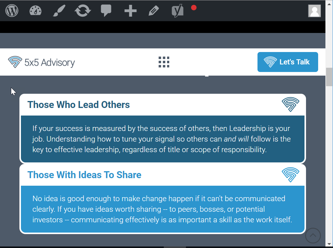
Thank you for writing in, but I can’t replicate the Headline graphics overlapping issue, this is how the header looks on my end on smallest screen-size before its switch to the mobile layout.

To resolve the second issue, please remove the CSS code provided previously, and then inspect the first 1/2 column of each Row of the “Who I help” and “How I help” sections. Then on the Column inspector under the Customize tab, you’ll see an Element CSS field. Please add the code below on that field.

@media (max-width: 767px) {
	$el.x-column.x-sm {
		margin-bottom: 2em;
	}
}
You can also apply this to Rows with more than 2 columns by adding that Element CSS to all columns except the last column.
Hope it helps,
Cheers!
Perfect! Thanks!!
You’re more than welcome, glad we could help.
Cheers!
@friech - That first issue was resolved on the main page due to my reformatting the “How I Help” headline elements. However, here’s an example where it still appears on the “About” page when viewed on a mobile screen:
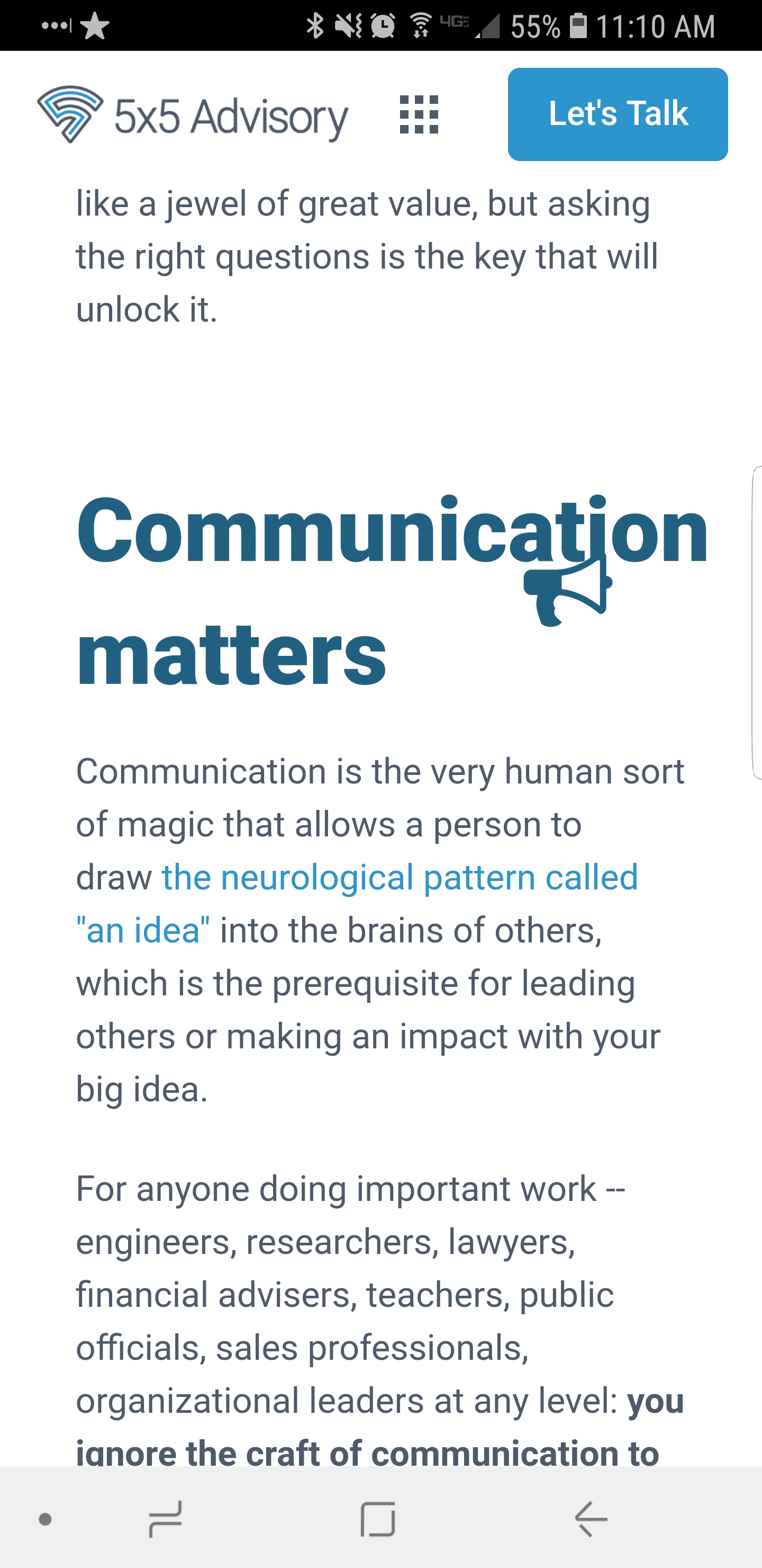
Weird: my uploaded screenshot won’t display all the way. Here’s a link to the full image: https://www.screencast.com/t/nFKgNpMvDeuM
Hi lancesalyers,
Reducing the font size of these headings on mobile devices should resolve this issue, to do so please add this CSS snippet to (X > Theme Options > CSS):
@media screen and (max-width: 680px) {
    .x-text-content-text-primary {
        font-size: 1.8em!important;
    }
}
Thanks.
This topic was automatically closed 10 days after the last reply. New replies are no longer allowed.