Headline below Header Image

I have a headline below the header image on my homepage. I’m trying to get the margins equal on both the desktop and mobile version. I recently changed the dimensions of the header image on the mobile version, so it appears bigger/easier to read, but now that headline is on top of the header image when you view it on mobile. I’ve played around with margins and padding, but can’t figure it out. Can you offer any insight?

Desktop: Humanity-X.com

Mobile Image:

Hi Bryan,

Thank you for the screenshot. The issue is a result of -2.5em bottom margin on section 1. See this: https://screencast-o-matic.com/watch/cq6nhgul6v

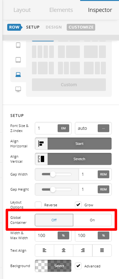
Checking why you have added it, I can see you want the content of first section to be fullwidth. No need to add negative margin to achieve that. Inspect the ROW of the first section. Then under Setup > Global Container: Set this to OFF

Remove the negative margin and it should work as needed.

Hope this helps.

Great, thank you. I made the suggestions above. The text still sits on the edge of the image at a 0 margin. If I move the bottom margin to 2.5, it would look normal on mobile. But then the desktop version would be too far below the image. What do you suggest I do here?

Hi Bryan,

You said that you have changed the dimensions of the header image on mobile version and it’s this code in the screenshot, right?

Can you add this line there margin-bottom: 80px; ? So that when the image scales up, it will also add a bottom margin to the image that will push the headline down.

Hope it helps.

Please read my original message to reference the line I am inquiring about. It is not the main header, but the headline below the top image that says “HumanityX Coming Fall 2020.” Thank you!

Hi Bryan,

@albrechtx is correct about the root cause of the issue.
See this: https://screencast-o-matic.com/watch/cq66I0uTUq

The overlap is cause by that custom CSS. Now, either remove that CSS that transform the image or add bottom margin. Make sure that bottom margin was added inside the mobile media query so it won’t affect the desktop view.

Hope this helps.

Thank you. How do I edit the mobile version only?

Hi Bryan,

You mean access that CSS? Inspect the image, then go to Customiza Tab > Element CSS. You can see that custom CSS there.

This topic was automatically closed 10 days after the last reply. New replies are no longer allowed.