Headers.....why?

I am having the toughest time trying to figure out the “magic” behind making good looking headers within X. I am now on my third demo import because frankly, this theme is buggy as hell.

Icon 10. Home page. On demo, it says background image is 1500x750 but you have another image in front of it that says 400x200. I don’t want text or an image layered in my header. I just want one, static 1500x750 header image that is mobile responsive.

Every time I have imported a graphic at the 1500x750 size its great. But once I delete the 400x200 placeholder image in front of that, my header gets cut off and doesn’t become responsive. It looks horrible.

This has been an ongoing issue with your theme for the better part of three years now (yes I am a long time user, over 10 websites now built with X) and for the life of me, I am still stumped at your inability to make good headers.

Do I need the pro version for X to be stable? It seems like you are forcing people into that by making headers a god awful experience out of the box.

Please elaborate on what I am missing here, I have read all of your documentation online regarding headers.
Hi MTB,

Thanks for reaching out.

The demo is just provided as a sample where you can start working on or just test it. It’s not mandatory to follow what’s imported, example, you can edit the content and just upload a single image with 1500x750 without a background or other images.

The background image respond to its container in which containers respond to its content. Hence, removing the content like the image will result to zero content, zero height container, and of course hidden background.

Possible solution is adding gap element replacing the image element, or simple remove your 1500x750 as background and just insert is just an image element.

Thanks!

Thanks for the reply. I ended up just deleting the import from the theme and replacing with a slider. Works for what I need.

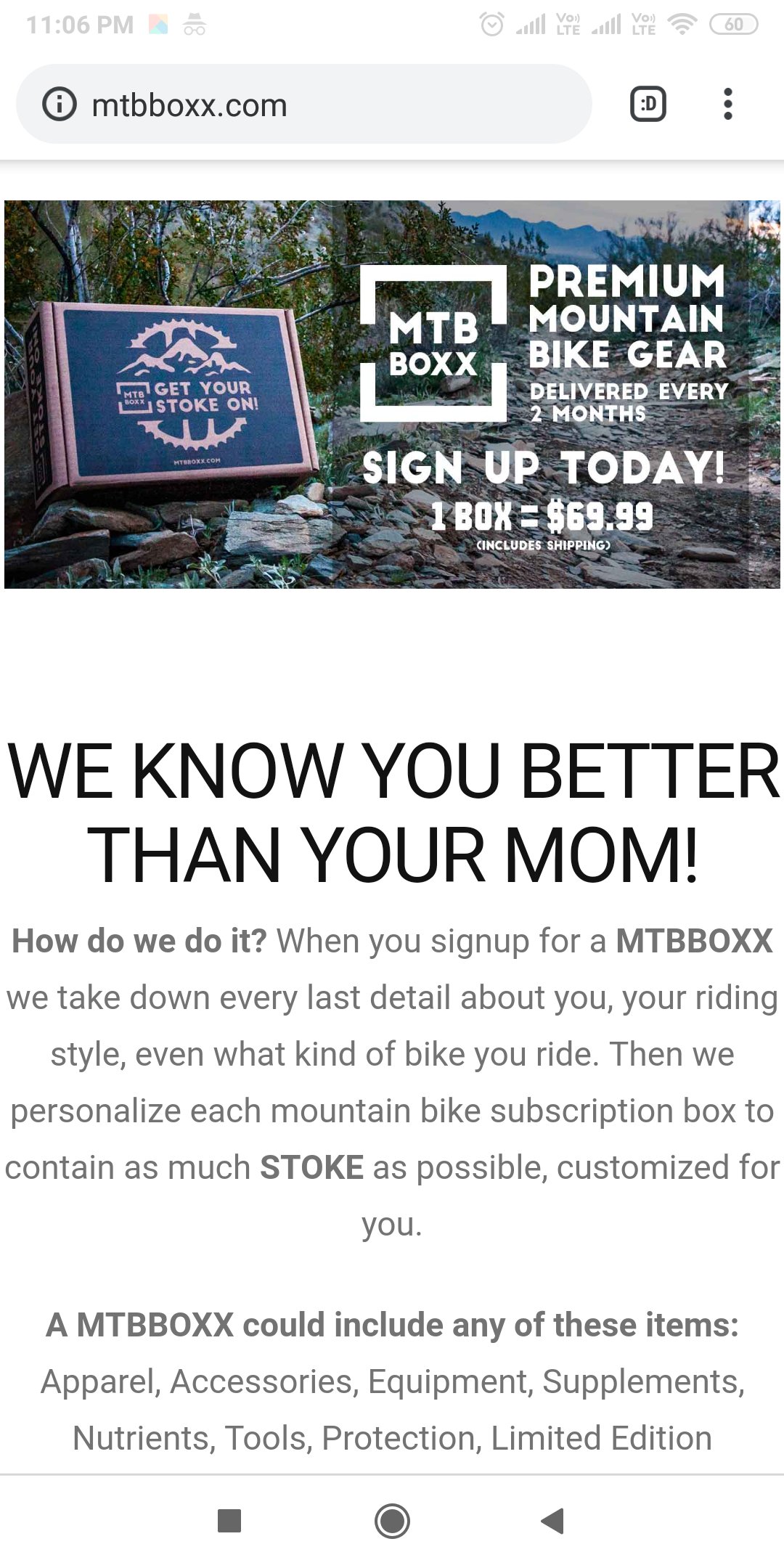
Question, on my under construction page, it won’t load the page on mobile. www.mtbboxx.com can you let me know why?

Hello MTB,

Thanks for updating the thread.

On my end link you have shared is working fine on mobile device. Please clear the cache and try loading the website again.

Thanks.

Hi. That’s the same thing I see as well. But there is a lot more to the page than that first part. Where is the rest of the page?

Hello @mtbboxx,

To resolve this issue, please edit your landing page back in Cornerstone and insert the following custom css in the settings tab, Settings > Custom CSS

html, body {
    overflow: visible !important;
}

We would loved to know if this has work for you. Thank you.

Yes that solved it, thanks so much!

You’re more than welcome, glad we could help.

Cheers!

This topic was automatically closed 10 days after the last reply. New replies are no longer allowed.