Hi there,
Actually, that is the normal behavior of the columns inside a section. the thing is that our theme already has a header section and you want to add a header inside the builder which is not a function offered out of the box.
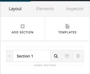
The solution for that is you add a class to the wrapping section of those columns. You can add a class to the section by going to the Layouts tab of the Cornerstone and clicking the magnifying glass icon of the mentioned section:
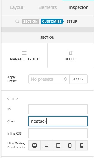
Then you need to click on the Customize tab and you will see a section to add the class. For example, add the nostack class there:
Then you will need to add the CSS code below to X > Launch > Options > CSS:
@media (max-width: 767px) {
 .nostack .x-column {
    width: 48%;
    float: left;
    margin-right: 2%;
 }
}
Please kindly consider that this is considered as a customization and is outside of our support scope. We will not be able to implement or maintain the code for you and you will need to do the rest yourself.
Thank you for your understanding.
