Header wide as screen and "under" topbar when scrolling

a simple question maybe, but how:

  1. do i get my header as wide as the screen?
  2. do i get my header to go “under” the topbar with the menu on it when a reader is scrolling through the page
  3. also: what are recommended sizes for a header, i have been all over with my headers and would like to make it uniform… :slight_smile:

this is how it is:

and this is how i would like it:

Hello @wonderacademie,
Thanks for writing to us.
I checked your website it seems that you have already set site layout wide and full width.
You can customize it more as per your need from here.
Please follow these steps
Go to Dashboard --> X--Theme options-- Layout and Design
Please have a look at the given screenshot below. You can customize from here.

For your 2nd query
You can set your header Fixed at the top to achieve your desired layout as you have mentioned.
Go to Dashboard --> X--Theme options--Header
You will get more settings here, you need to select “Navbar Position” as “Fixed Top” to achieve your desired layout.
Please have a look at the given screenshot below
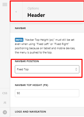
fixed-header

For your 3rd Query
It totally depends upon your content, logo size and your personal choice. You can customize any layout for the header as per your choice.

Thanks

1 Like

thank you, question 2 was answered with this. but question 1 not.
what i am looking for is that there are no “white edges” left and right of the header.
(i dont see the option to attach files here, maybe i have to make a new topic?)

Hi Wonderacademia,

Regretfully, there’s no option in our theme to have a different site width and site max-width on Navbar and Content. In order for you to have a different site width and site-max-width, you need to add some custom CSS code. When I checked your website and I found out that you already added custom code to make your header width 100% and to make your website navbar full size the same as the screen you need to set max-width:100%; to your custom code because currently the max-width of your navbar is set to 1500px then if the screen is greater than 1500px it will have some margin on left and right. See the example screenshot below.

Please note that custom development is outside the scope of our support. Issues that might arise from the use of custom code and further enhancements should be directed to a third-party developer.

Hope that helps and let us know how it goes.

Thank you.

This topic was automatically closed 10 days after the last reply. New replies are no longer allowed.