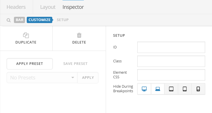
I have been working on a new header for my website. However, I cannot make the responsiveness behave the way I want it to. The site is www.rearviewteater.dk.
How do I make sure the adjustments I make to margin and padding in the desktop layout don’t affect the mobile layout?
Right now, it pretty much looks the way I want it to on desktop, but on mobile the logo is off center (vertically), and I would like the name to be centered (instead of being affected by the padding I added between the logo and the text).
How do I do that? Before I switched to pro recently, I added some custom css that I found in the forum, and it did the trick to make it look good on mobile back then. I have left it in there, just so you can see it. 
/Astrid