Hi,
I’ve been trying every which way I can think of but ultimately have failed.
For our mobile menu, using Pro header builder.
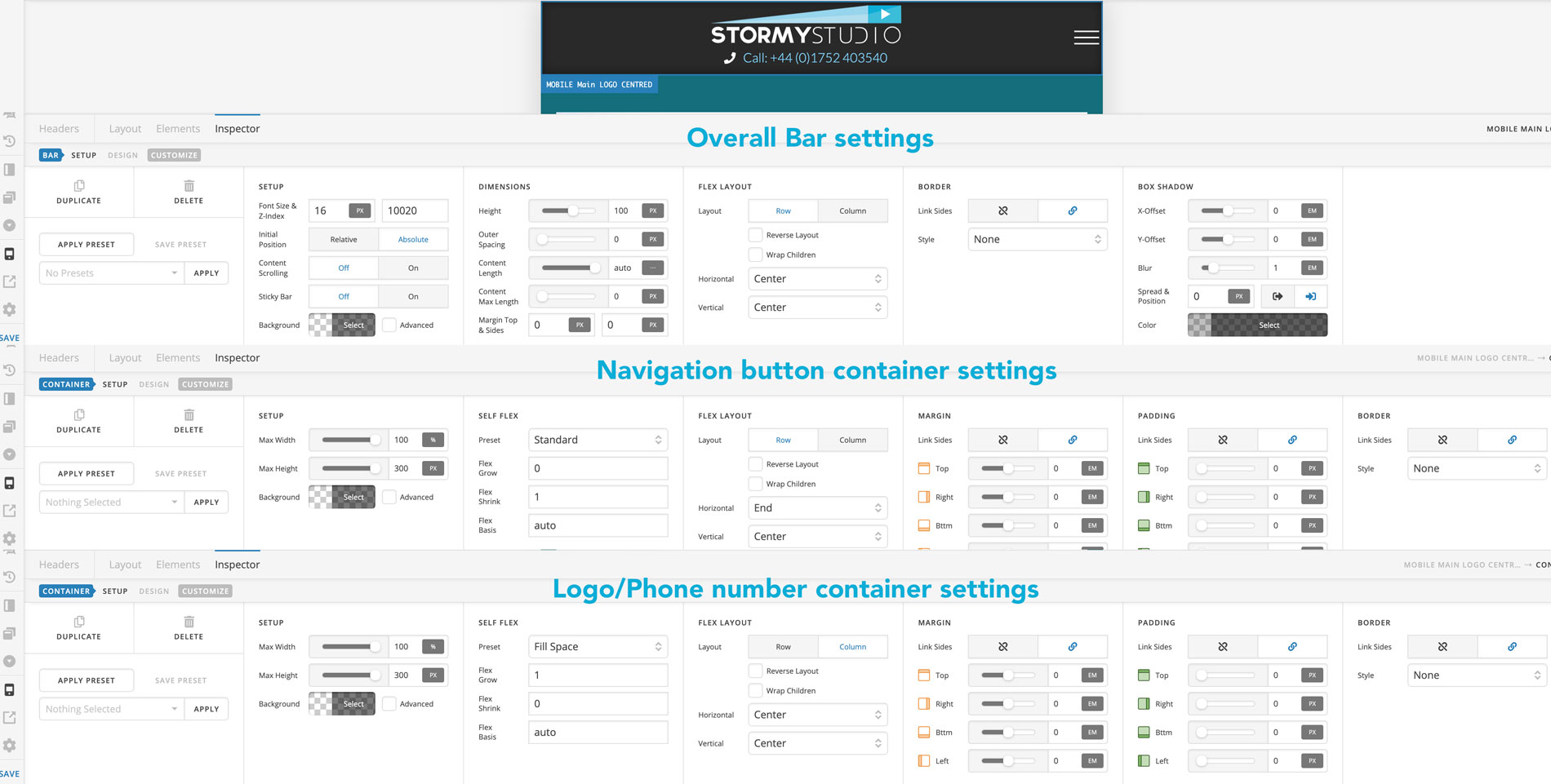
I wanted our 'business logo centred (with clickable link to homepage) , with the clickable phone number below it.
Then the ‘navigation layered’ hamburger button aligned to the edge of the header.
I managed to get it arranged correctly.
• With the logo and phone number button, on one bar … one container with the two elements. stacked one above the other and correctly centred
• The navigation then added to a separate bar with a different Z-stack value so it appeared above.
So it looked correct, but this meant only the menu was clickable and not the logo/phone number as they were on a lower Z-stack.
If I put everything in the same bar I cannot successfully have the logo/phone number centred. With the menu ‘hamburger’ button aligned to the far right.
Any ideas?