I know you can limit your headers to various pages on your website, but can you limit them to screen size? I am designing this website where the header is on the right side of the screen. In my header I have an image with the logo and the menu. Even if I use one of the hamburger modules when the screen goes down to a smart phone size the header remains the same size on the right, making it impossible to see content. What I would really like is to have the header on the right for larger screens and then have it switch to the header being on the top when it gets down to smaller sized screens. That way on the smaller screens I can put the logo and the hamburger menu on the top. I have searched your docs and the forum and haven’t been able to find anything about this.
As you can see in the screenshots, it is not feasible to have a header with menu on the side when using a mobile app.

Hi @GeminiRising,
Thanks for reaching out.
Since you are using Pro, I suggest that you will use the header builder where you can customize the header layout the way you wanted.
You can check our YouTube videos on how to use the header builder:
https://www.youtube.com/channel/UCgY5E3tOI83kBEahh9Y3uRg/search?query=header
Check our docs about the header builder:
https://theme.co/docs/header-footer-overview
Hope that helps.
Thank you.
Thanks for the quick response. Unfortunately it hasn’t really answered my question. I checked out all the YouTube videos and I had already gone through your documents. The only video that kind of came close was the video about sticky headers.
I want the header to be on the right side of the screen when on a computer monitor and the larger mobile screen. I then want the header to disappear on the right and appear on the top when using smaller mobile devices and smart phones. Is this possible with Pro?
Hello @GeminiRising,
To show header bar on the right side in larger screen devices and hide it smaller device. Please follow these steps.
-
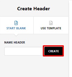
Create a header from Pro–>Header
-
Let’s create top Header for the small screen mobile
-
Click on Top and add an element that you want to show in your headers like hamburger menu and Logo for that you need to add image element and Navigation Dropdown.
-
Now set visibility of this header that will be only on small screen mobile device for that you need to click on magnifier icon of the Bar. Click on Customize and set the visibility from here. Please note that you should disable it from all the larger screen.


- Let’s create the right header. Click on Right

Now add all the elements that you want to show in your right side Header.
- After that click on the magnifier icon of the Bar then click on Customize and set the visibility of this header that would be visible in all the larger device and disable in small mobile screen

Hope It Helps
Thanks
thank you, that worked!
This topic was automatically closed 10 days after the last reply. New replies are no longer allowed.