Header Menu Builder Design Issue

Hi Guys,

I have three levels of menu, one for desktop, 2nd for 481-767 and last for mobile 480 or smaller screen. The issue i am facing is that i created 2 header menu initially with above 3 menu levels and assign one header to front page and other to sub pages and the issue is that menu jumping into top-center on scroll.
check my website and see them on different responsive resolutions.
www.shop.dezinar.com
I try your code before mentioned below but it creating a space before scroll above the menu.
@media(max-width: 480px){
.hm52.x-bar {
top: 0 !important;
.hm62.x-bar {
top: 34px !important;
}
}
}

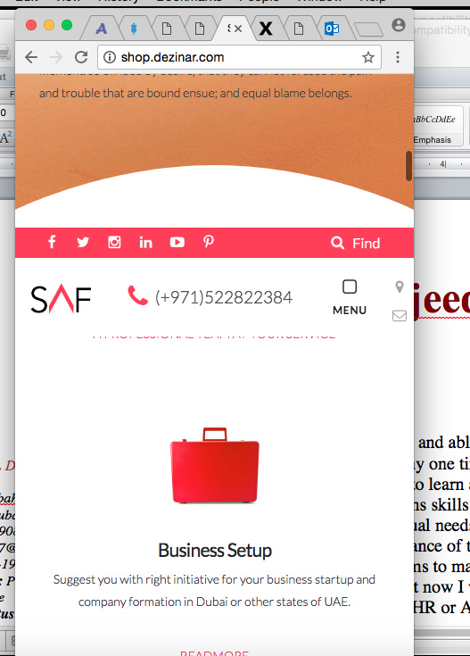
Below are the device screen on which its not working fine ( Desktop and 480 and smaller )

Hi There,

Thanks for writing in!
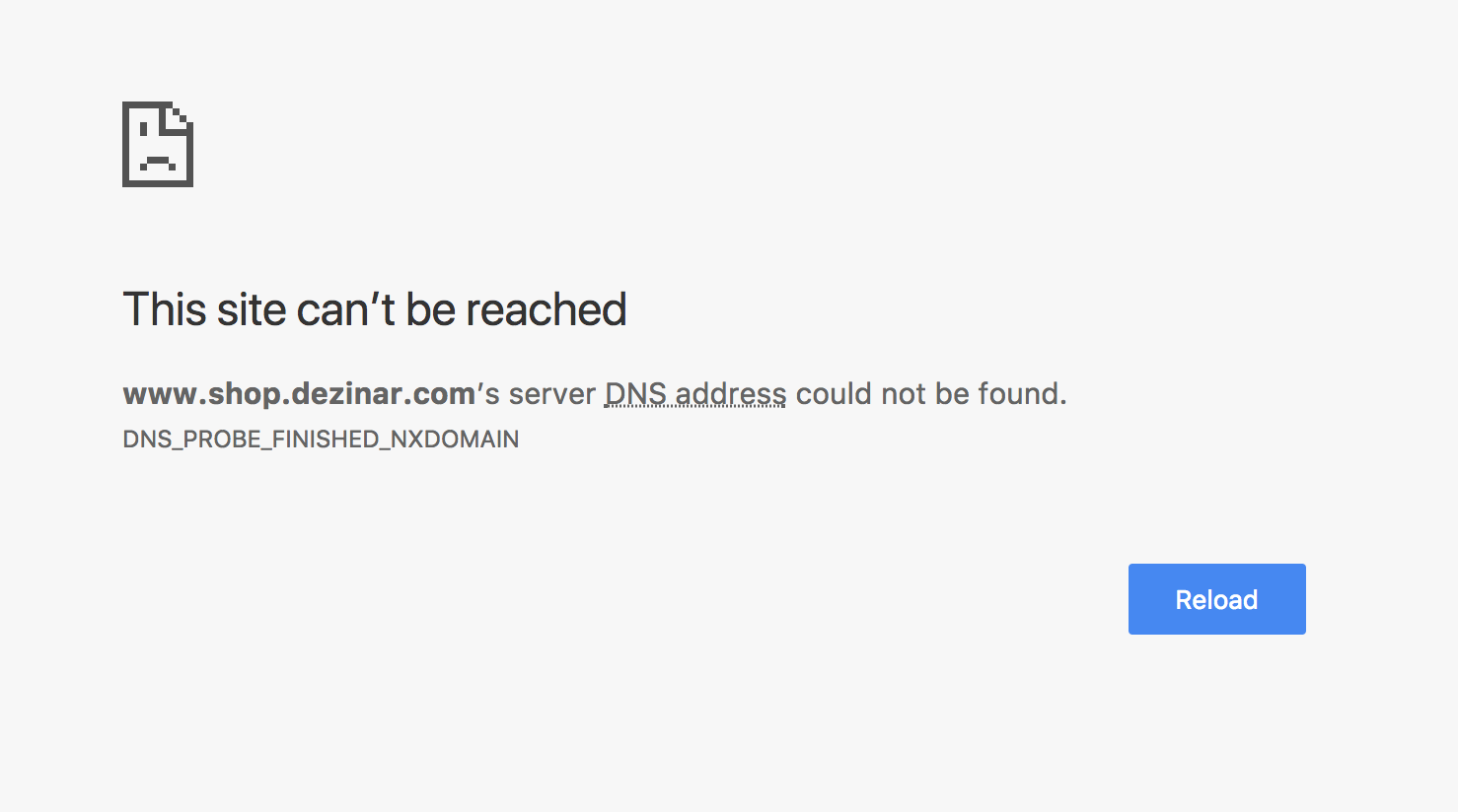
The site url is not working for me throwing the following error.

Please check and also you can send us your login details too in a secure note to check your issue.

Thanks

Hi, Please check its working on my end on different devices aswell.

http://shop.dezinar.com/

Hi,

You can try this code instead.


@media(max-width: 480px){
      .hm32.x-bar-fixed {
              top: 32px !important;
       }
}

Hope that helps

i try this for desktop version its working perfectly
.hm32.x-bar-fixed {
top: 65px !important;
}
}

but for mobile version for home page and sub pages i need code to fix.

Please add this following CSS:

.hm52.x-bar.x-bar-top.x-bar-h.x-bar-relative.x-hide-lg.x-hide-md.x-hide-sm.x-hide-xl {
    top: -437px !important;
}

.hm62.x-bar.x-bar-top.x-bar-h.x-bar-relative.x-hide-lg.x-hide-md.x-hide-sm.x-hide-xl.x-bar-outer-spacers {
    top: -436px !important;
}

Let us know how it goes.

Thanks.

the above code not working for me, i am able to fix it but only thing left is to remove space below the top bar in mobile view. When we scroll it showing fine but before scroll in fixed position their is 34px space.

can you have a look and fix that as i already sent you my credentials in secure note in last reply.

i used the below code

@media(max-width: 480px){

.hm52.x-bar{
top: 0px !important;
}
.hm62.x-bar{
top:34px !important;
}
}

See this image i change background color, so space below top bar can be visible.

Hi There,

Please add this following CSS:

@media (max-width: 480px) {
    .hm62.x-bar {
        top: 0px !important;
    }
    .hm62.x-bar.x-bar-fixed {
        top: 34px !important;
        transform: translate3d(0px, 0%, 0px) !important;
    }
}

Hope that’ll work.

Please let us know how it goes.

Thanks.

This topic was automatically closed 10 days after the last reply. New replies are no longer allowed.