Hi,
The header for the website hasicha.org.il is cut in the mobile-view.
How can I control the mobile view of the header, and add the standard pull down (three lines with the menu)?
Thanks!
Hi,
The header for the website hasicha.org.il is cut in the mobile-view.
How can I control the mobile view of the header, and add the standard pull down (three lines with the menu)?
Thanks!
Hi,
You need to create two versions/container of you header.
One specifically designed for desktop and another one designed for mobile.
Then you can hide the mobile version in desktop and hide the desktop version in mobile using the visibility option.

Hope that helps
How to achieve that?
Hi There,
On The Header Builder on the left, you can choose the device view you want to see the header.
On each Bar, Container and Element on the header builder you have a Customize tab.
On this customized tab, you have an option to hide it based on the screen size.
You can then hide the elements or, bar and create a totally new bar for the mobile layout.
This bar you would hide on the desktop and other views you don’t want it to appear.
Hope it helps
Hi,
I am on desktop view from my computer, and enabled the header in all of the views, and the header still isn’t showing.
To avoid doubt, the header doesn’t show when I high-light any other view - either in the builder or in the different views presented (at the top). It just isn’t there.
Thanks!
Hi There,
Check for the error on the console. I am seeing it when I check. 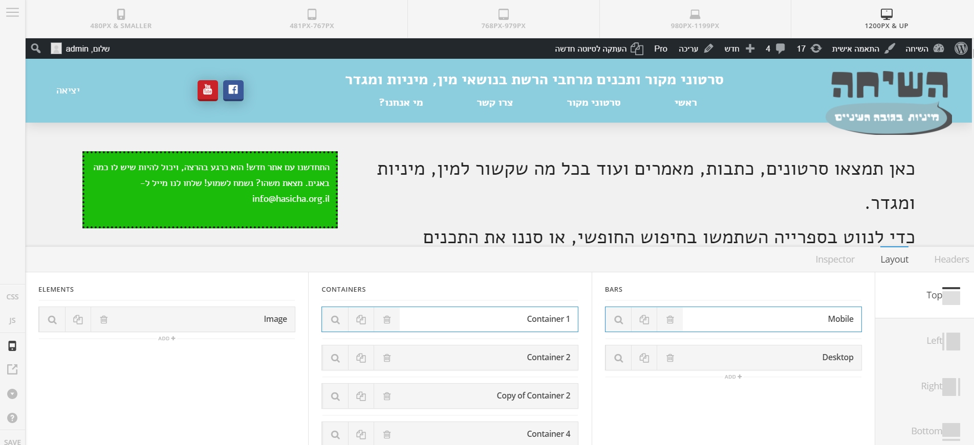
Thanks! It works now. How can I make one of the navigation-inline containers be mobile-friendly (having three lines that open up a drop-down list) instead of the whole view?
Thanks!
OK, I figured it out by switching out the navigation inline with the navigation modal. However, now it opens a full window for the menu. I would like to make it much smaller, and come from the side, instead of going over everything. How can I achieve that?
Thanks,
Alon
Hi There,
Choose Slide In instead of Modal navigation element.
Hope it helps!