How can i make the header builder responsive to mobile layouts cause when i make a menu it stacks and breaks the menus on mobile. The modal menu just stay stuck out and how can i distinguish when to use it over the other.
Hi there,
Please kindly go to the Customize tab of the Inline Navigation element which you used and hide it for mobile views:
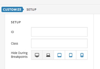
Then kindly add one of the Navigation Collapse or another element for mobile devices which will be better to show on those devices and hide them for the desktop view.
That way you will have a separate element for each view which you can customize as you like.
Thank you.