Hey @Pbalazs89,
Thanks for the video. Because your site’s offline, I can only assume what your setup is. Below is my replication of it.

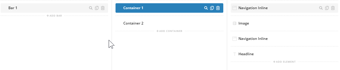
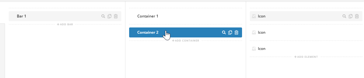
To balance that setup and make the navigation and text centered, add another container above the logo and navigation container and add a Horizontal Gap Element to it. The Gap width should be close to the total width of the icons.

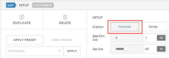
As you can see in the screenshot below, that setup will center the middle container which contains the logo, navigation and text.

The entire setup for that is quite tricky though or it has many moving parts. If you like, you can follow the alternative setup below. Setup a Bar with Flexbox Child Placement set to Column and Align Horizontal to Center. That will stack and center the containers. The first container will contain the gap, logo, navigation and icons. The 2nd container will contain just the text.
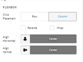
Like the first example, I’m still using a Gap element to balance out the design or center the logo and navigation in the first container.
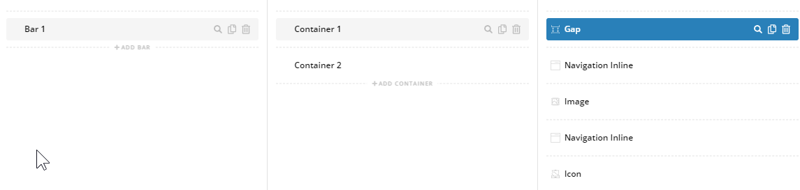
For the 2nd container, just add a Text element, you won’t have a problem with this 2nd container since it’s centered. Check the results below.


If you still have problems with this, please upload your site to an online server and give us the URL so we could see the exact setup.
Thanks.
