Header / Bar / Containers in rows or columns depending on viewport size

Hi there,

I have a header bar with three containers, flexbox: “row”. Perfect on desktop, but not enough space on smaller screens. So I’d like to have the flexbox behaviour change to “column” on smaller screens. How can I do this?

Of course I could design a second header with viewport “column”, but I’d prefer to have only one header, if possible.

Best regards

Uli
Hi Uli,

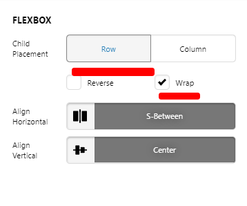
For BAR, set the following FLEXBOX settings:
Global - Headers - Pro (1)
For each of your column, set SELF FLEX > FLEX BASIS. Adjust the value that is suitable for all viewport:

See this: https://screencast-o-matic.com/watch/cYfQ6uawRM

Hope this helps.

Hi lely, great help, works perfect. Thank you!

All the best!

Uli

Glad we could help Uli.

Cheers!

This topic was automatically closed 10 days after the last reply. New replies are no longer allowed.