Is there an easy way to create a Grid that matches the overall site layout?
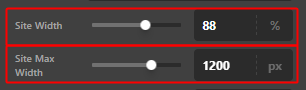
As an example if my site width is 88%, and my Site Max Width is 1200px, and my Content Width is 72%
Can I match this either with variables or with some other Grid magic?
Is there an easy way to create a Grid that matches the overall site layout?
As an example if my site width is 88%, and my Site Max Width is 1200px, and my Content Width is 72%
Can I match this either with variables or with some other Grid magic?
Hey @dabigcheeze,
I’m currently not sure what you need because, by default, the Grid already matches or is getting its Width from the Theme Options > Site Width and its Max Width from the Theme Options > Site Max Width.
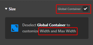
With that said, I believe you unchecked the Global Container option and set your own Width and Max Width. Please check the Global Container.
If you mean you want to get the Site Width, Site Max Width and the Content Width dynamically, that is not possible.
The Content Width doesn’t apply in the Grid, by the way. It’s only for the template with Sidebar / Content.
Hope that helps.
It was already solved from someone in the Facebook Group using this grid column layout, but thanks.
minmax(6%, 1fr) repeat(12, minmax(auto, 100px)) minmax(6%, 1fr)
Hey @dabigcheeze,
We’re glad that you’re able to figure it out! If you have any other concerns or clarifications regarding our theme features, feel free to open up a new thread.
Thank you.
This topic was automatically closed 10 days after the last reply. New replies are no longer allowed.