Grid Element to replicate site width and margins

Hi

Could you let me know if the following is possible

I have a section with one row with the global container off.

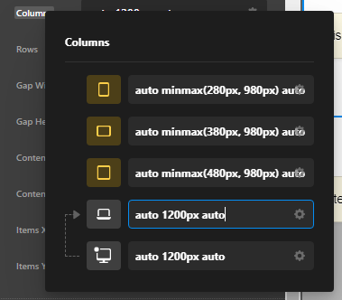
Within that row is a Grid Element with the following ‘auto minmax(320px, 1200px) auto’ for the columns. I was hoping to match the site width margins etc using a grid.

The aim is to have an image element that I can add a scroll effect to that fills the width of the browser with a title over the top.

http://henryb9.sg-host.com/mediation/

Hello @henrybag,

Thanks for writing in! You have added the image on Cell 2 while Cell 1 and Cell 3 will keep giving a small space on the left and right of the image. If you want to have a full image that fills the width of your browser, just simply use auto minmax(320px, 100vw) auto in your grid column settings.

Kindly let us know how it goes.

Hi

Thanks for your response, it’s quite hard to explain what I’m trying to achieve.

I wanted to create a grid that was full width but that the central column would match the width of the site.

This would allow me to add a cell (that spans all columns) with an image in it. I can add scroll effects to the image. Another cell then sits on top of the image in the central column aligned to the rest of the site where the yellow lines are on the diagram. So the word ‘Mediation’, in this case, is aligned correctly.

It’s like using a grid to replicate the site layout settings basically, is this possible?

Many thanks

Think I’ve sorted it using this column set-up

minmax(3em, calc((100vw - 86em) / 2)) 1fr minmax(3em, calc((100vw - 86em) / 2))

it was trial and error on the figures rather than maths!

Hey @henrybag,

It looks like you have found a solution already using minmax(3em,calc((100vw - 86em) / 2)) 1fr minmax(3em,calc((100vw - 86em) / 2))

Alternatively, you can set the middle Cell (not column) to 1200px only like auto 1200px auto. That won’t be responsive in and of itself so you need to set different values per screen size like following screenshot. That will make the middle cell span 1200px while pushing other cells on the side.

image

If you’re not aware of the Responsive settings yet, please watch the tutorial video below.

Hope that helps.

This topic was automatically closed 10 days after the last reply. New replies are no longer allowed.