Grid Element, 1:1 image responsive auto scale down

WP v5.4
Pro v3.2.3
NEW Grid Element

Hello, Using the NEW Grid Element, I need my two side-by-side 512x512 background images to scale down, maintaining its 1:1 aspect ratio, and in the mobile breakpoint, I need them to stack one on top of the other.

  • I need to use the Global Container ON, to maintain the look and feel of the rest of the site.
  • I need a variable height that responds to the browser width.

I watched your Grid Element Videos and I replicated some of the setup pieces with no avail.

Thanks.
Hi @VGonzaloMartinez,

If you want it to scale and maintain 1:1 aspect ratio, you have to add it as image not background. As background, it will just follow the container size and it will resize depending on the content of the column. On smaller view, it will be longer vertical rectangle not square.

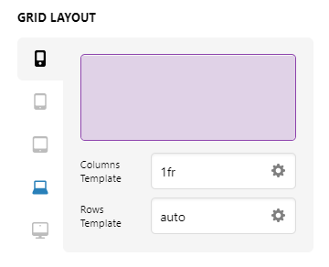
To stack on top of the other on mobile, under Grid Layout, Mobile view, set the Column template to just 1 frame.

Home - Content - Pro (5)

Hope this helps. If in case I misunderstand, please give more details.

1 Like

This topic was automatically closed 10 days after the last reply. New replies are no longer allowed.