Google Issue - Navigation on Mobile

Hello - after the latest update, the company name is extremely large when condensed on mobile in the navigation. Below is the custom code and a screen shot of what it looks like. How can I significantly re-size the font to be smaller.

/Three Lines with the word Menu/
.x-btn-navbar i:after {
content: ‘CORNER HOUSE PHOTOGRAPHY’;
font-family: hammersmith one;
padding-left: 10px;
}

Hello @SE1217707,

Thanks for writing in!

Please update your code and use this:

/* Three Lines with the word Menu */
.x-btn-navbar i:after {
  content: ‘CORNER HOUSE PHOTOGRAPHY’;
  font-family: hammersmith one;
  padding-left: 10px;
}

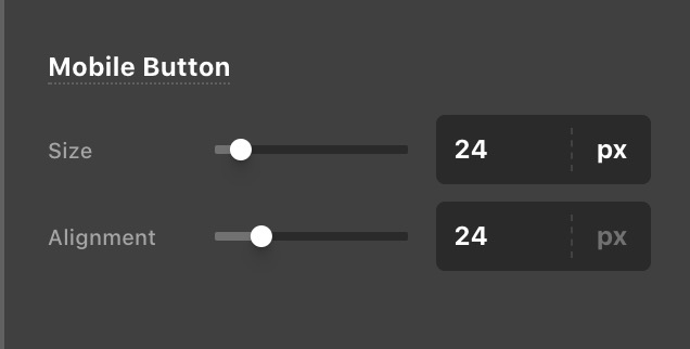
Please also go to your X > Theme Options > Headers > Mobile Button and double-check your font-size settings.
Screen Shot 2021-01-11 at 11.21.18 AM

Best Regards.

Thank you :slight_smile:

Hi @SE1217707,

You’re welcome and it’s our pleasure to help you. If you have any other concerns regarding our theme features, feel free to reach us.

Thank you.

This topic was automatically closed 10 days after the last reply. New replies are no longer allowed.