Howdy, @waynepatt58!
Thanks for writing in! Responsive Text is currently a bit of a tie-over from our early days of development with X (before the builders and all of that came along). You can read a bit about how the script functions here (even though the article is referencing the old shortcode, the same principals apply):
The first thing you need to do is choose a CSS selector. When I went into your page, I saw that the headline you referenced in your screenshots above did not have a custom class assigned that we can use to hook into the script we create later in the builder. To do this, I first went to your headline referenced in the image and navigated to the Customize tab in the control navigation above the Inspector and entered h-sub-header into the Class input like so:
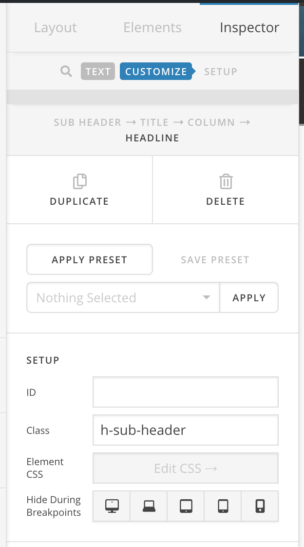
Ultimately, this class can be whatever you want it to be. The most important things to remember are:
- Whatever you pick here must match what you setup in the Responsive Text configuration later
- Make sure you don’t enter in the
. placed before class names when styling CSS, we’re merely declaring our class here, not referencing it
Next, we go over to the Settings Modal, and for your version of the builder you would go to Page Settings and then find the Responsive Text section. I deleted your old selectors as they were not doing anything, and added a new item labeled Sub Header as found below:
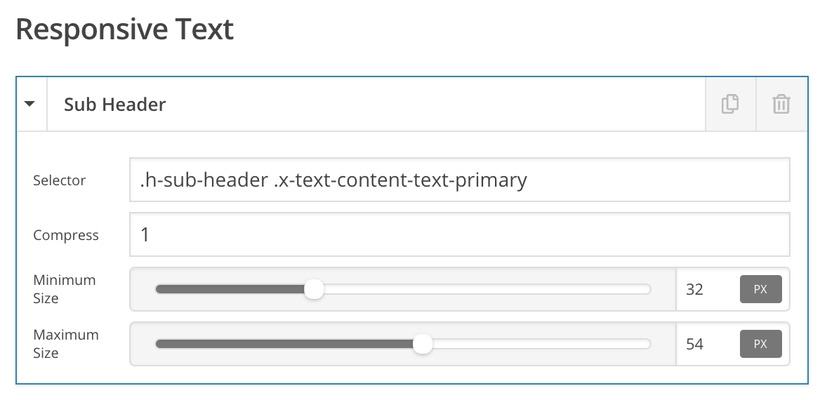
Notice that our Selector field states .h-sub-header .x-text-content-text-primary. The first part is our class given to the element from earlier, and since you’re using a v2 Text Element, we need to find the appropriate piece inside the element to adjust the font-size. The font-size is applied to the second selector in that statement, so to overwrite the size, that is the piece we need to target. Alternately, since you’re using an h2 tag for your text within this Element, you could also do:
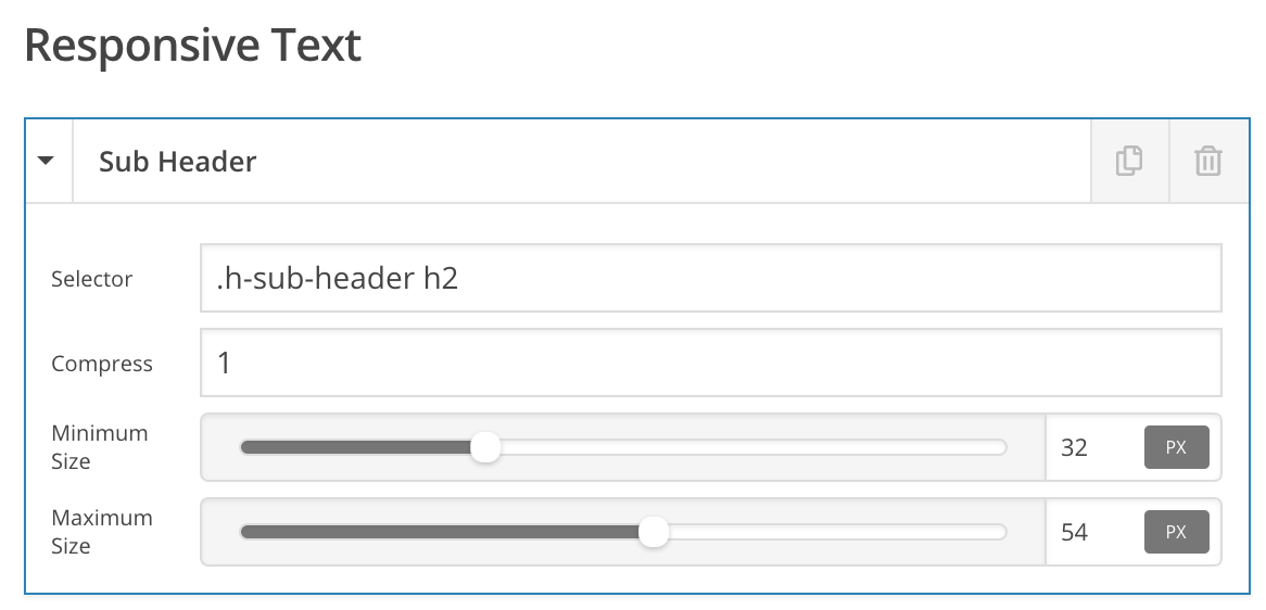
This looks a little nicer, but if you ever changed the tag down the road you’d have to come back here to update this part again, so using the class like the first example eliminates that concern moving forward.
Finally, I set the compression to 1 (which is a good place to start, and can be adjusted to suit), and then set some minimum and maximum font sizes for you. Now, when I look at the front of your site I see:

When sizing your screen up and down, you’ll see that the text shrink according to your settings. These are a few of the considerations needed when utilizing this responsive text implementation with v2 Elements (the biggest thing is to make sure the right selector is applied and set on all accounts). Hopefully this helps to point you in the right direction moving forward, cheers!


